Vanmoof.com
VanMoof is an electric e-bike brand, specialised in city commuting. I joined VanMoof as a Digital Product Designer to work primarily on the website, focusing on the discovery and purchase flows. Initially I created a new design system from a refreshed design direction, I worked on several new projects and initiatives to improve the usability and discovery of VanMoof products and services.
Direction
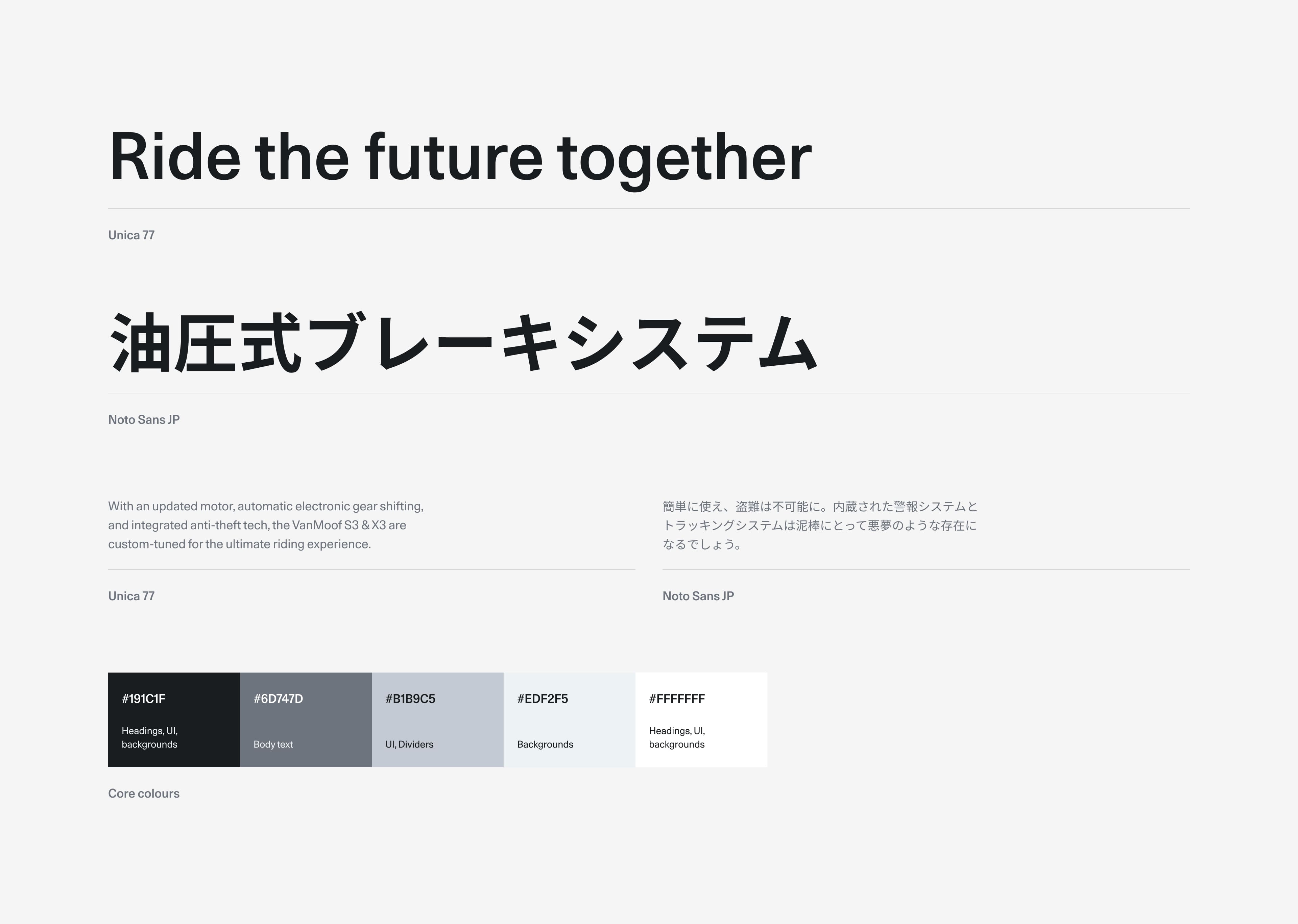
The minimal look and feel reflects the minimalist form of the bikes and their ease of use. Putting the product in a clear space while the UI demands less attention. Dynamic shots of riders on the bike are used more prominently, capturing the power and comfort of the ride while making the brand more human. The colour palette for UI was also refined to simply black and white to improve hierarchy and compliment marketing campaigns better.
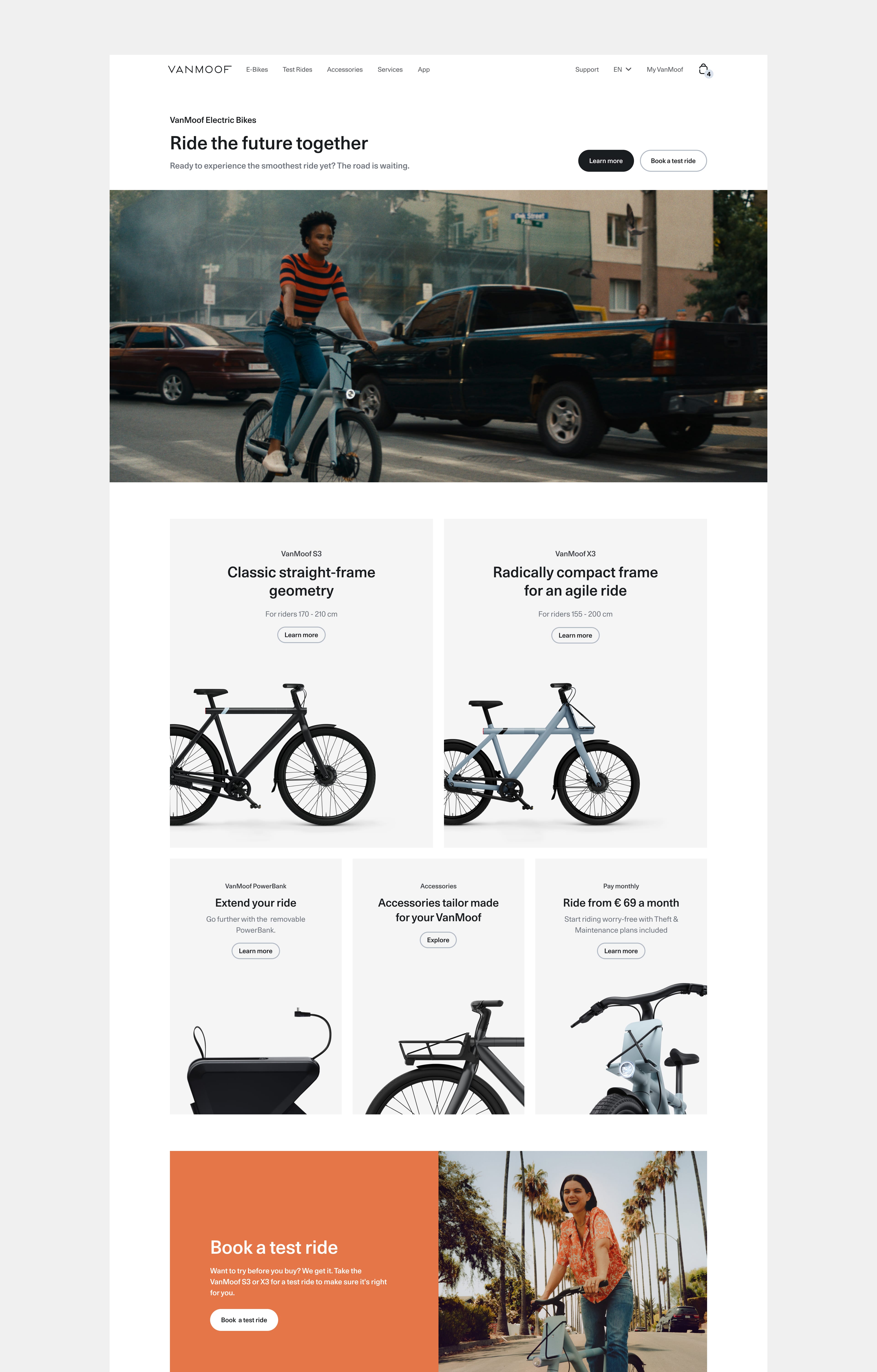
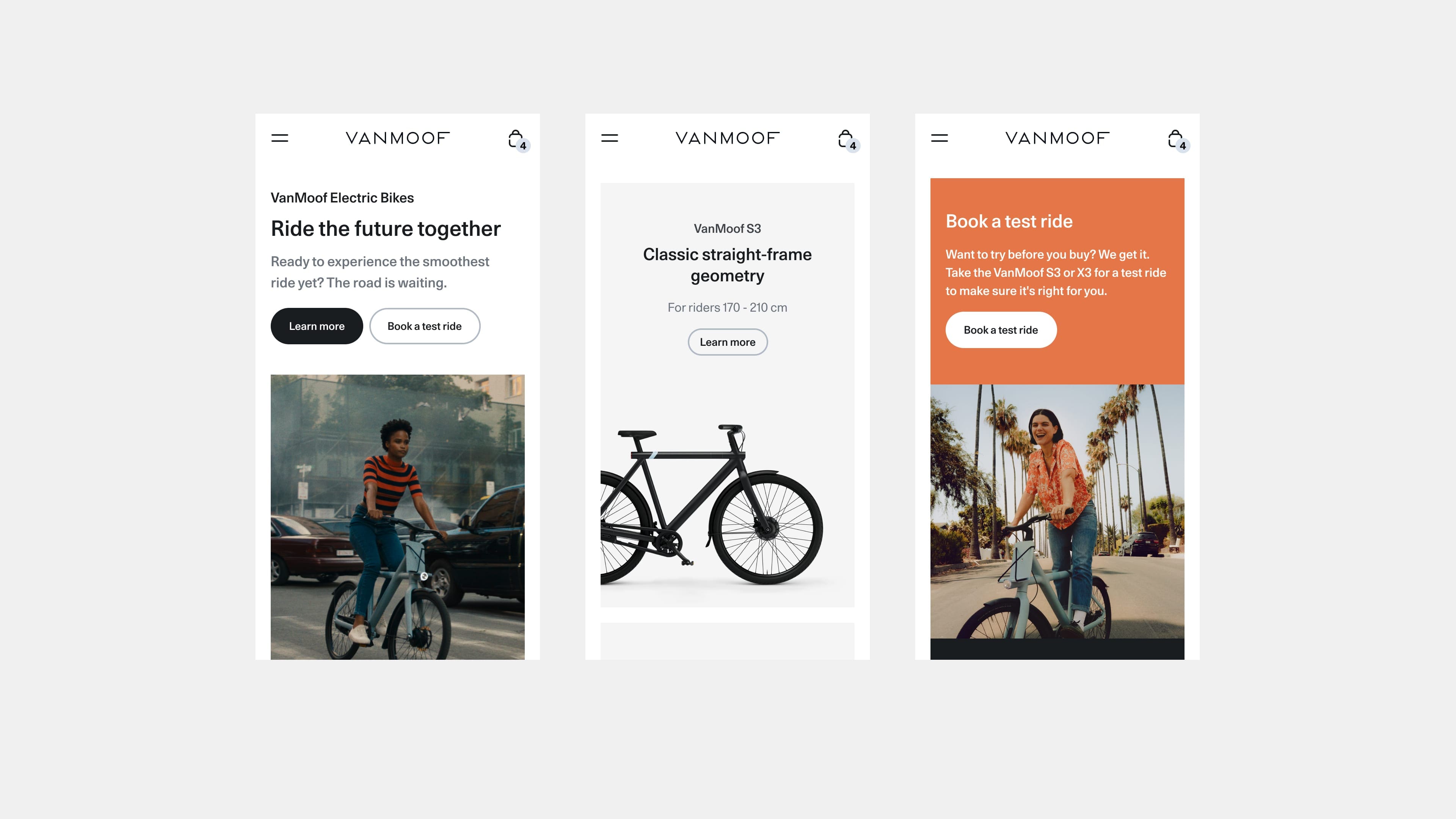
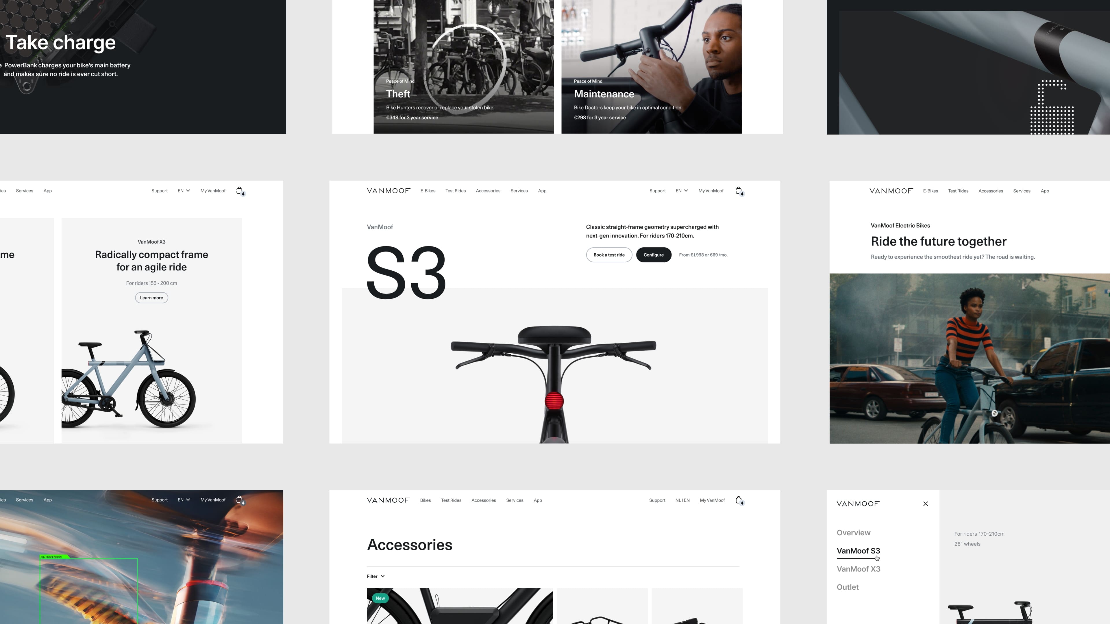
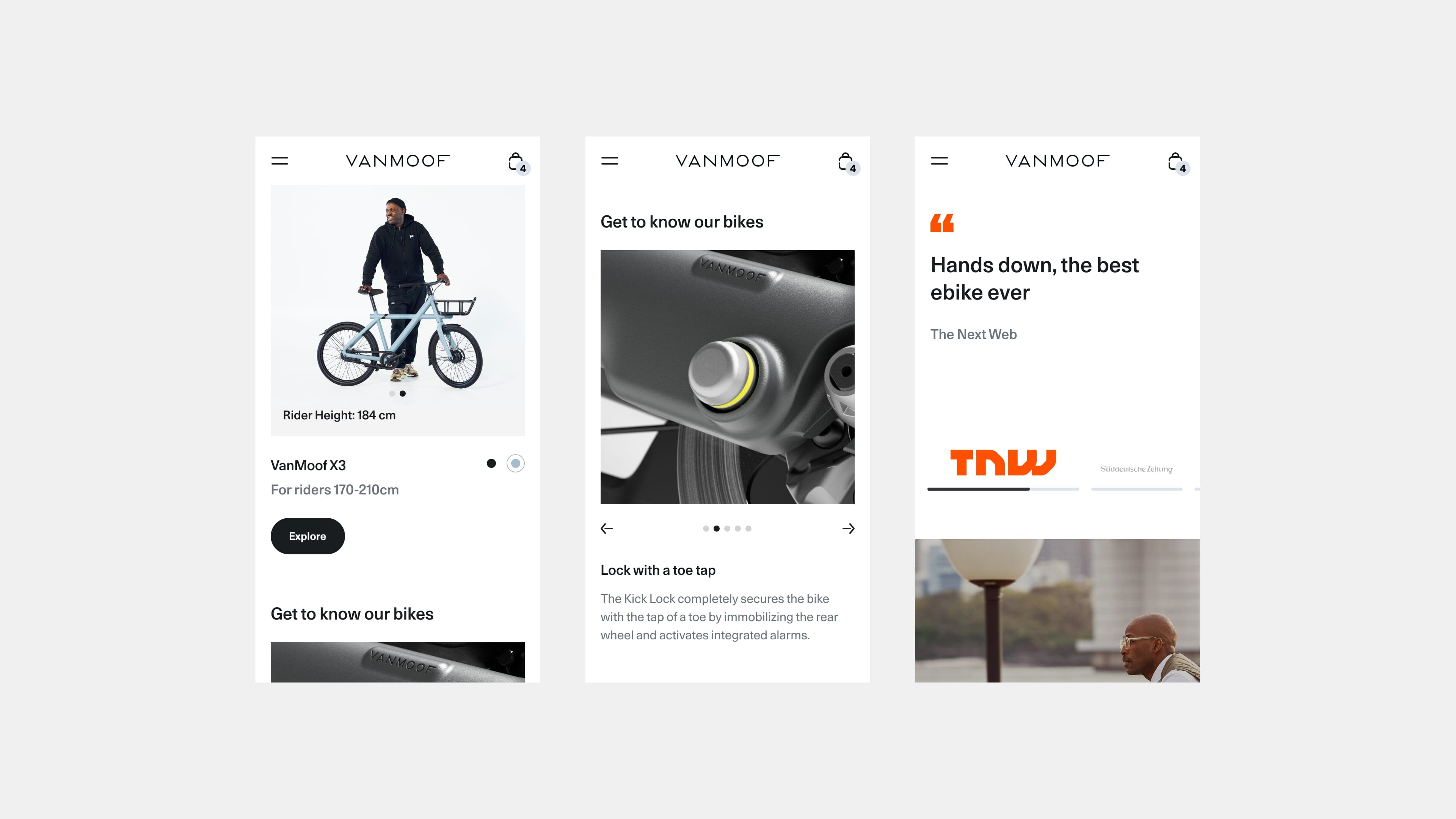
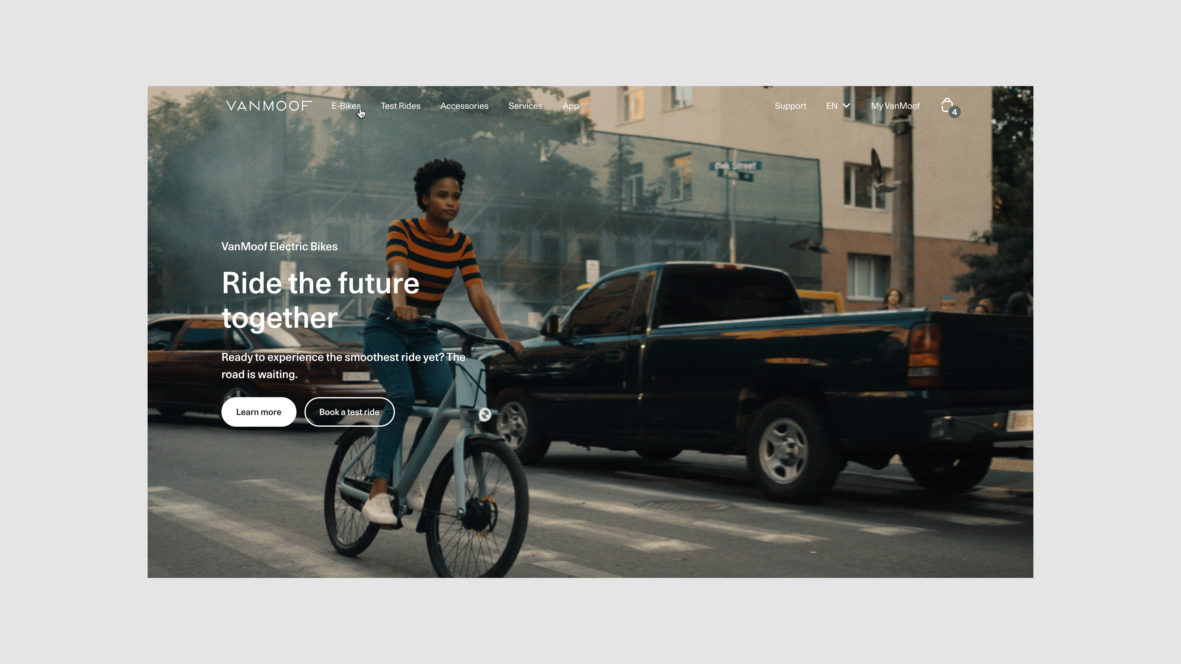
Home
The homepage is used to introduce the S3/X3 bikes and the other products and services covered. A modular cards system is used to show different content in a flexible way per market. Film content presents the and Insurance services and Test Rides experience in an engaging way.
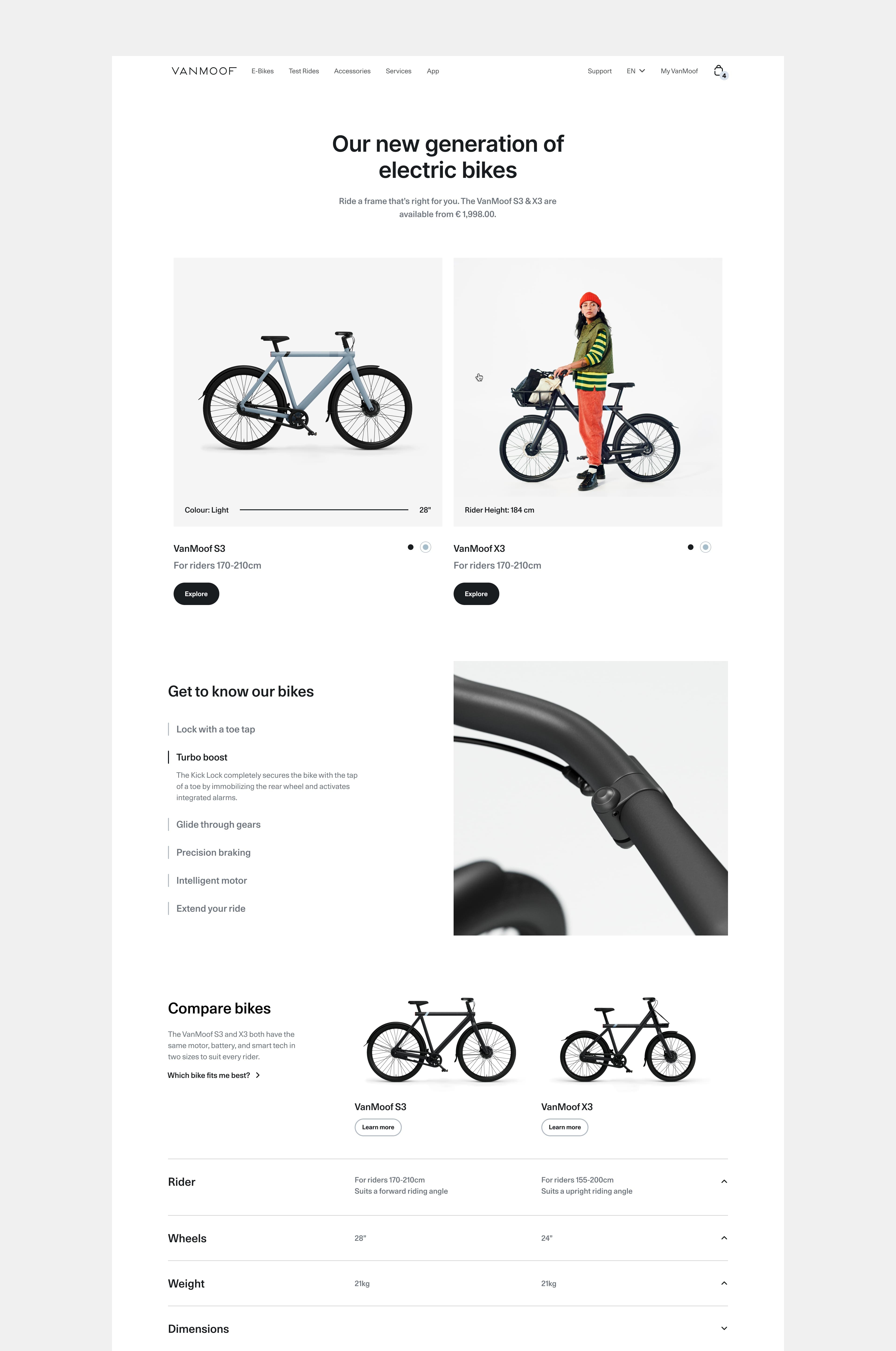
Product Overview
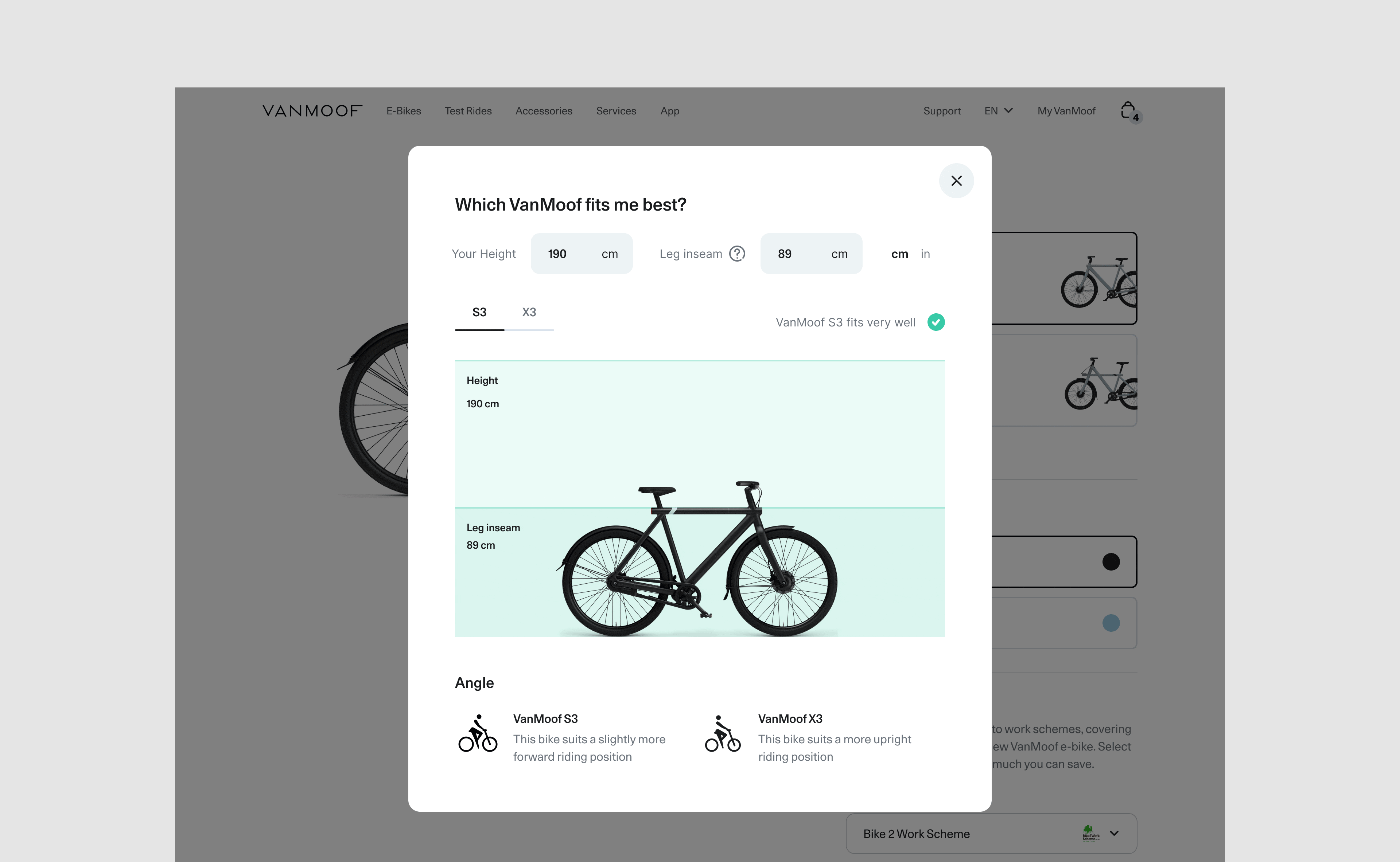
The product overview page briefly demonstrates the core features of both bikes. A comparison table is added below to show the key specs users look for and to clarify the differences between each frame. The photography used with the models also has a functional purpose to show how people measure up to the bike with a similar inseam and height.
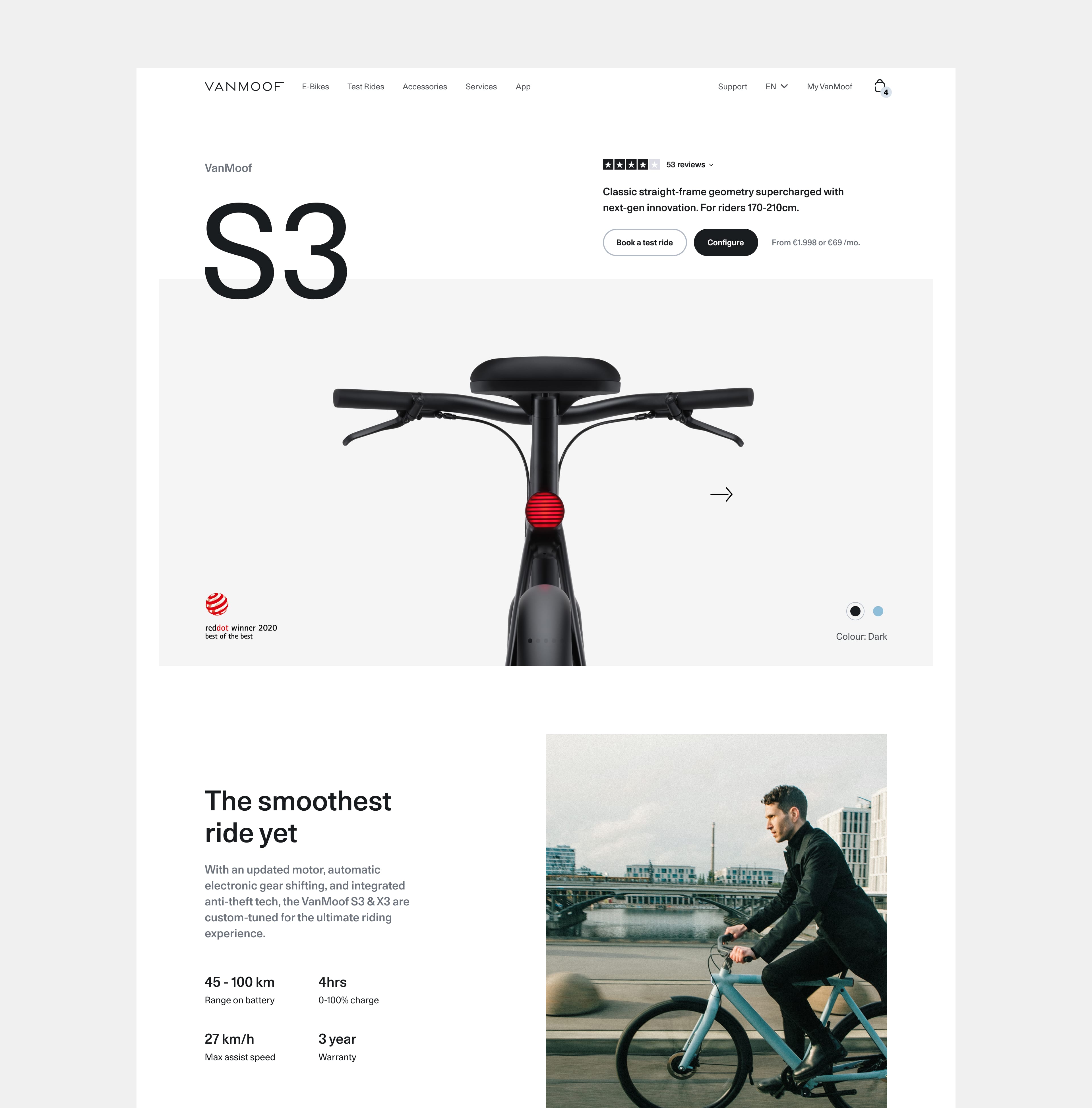
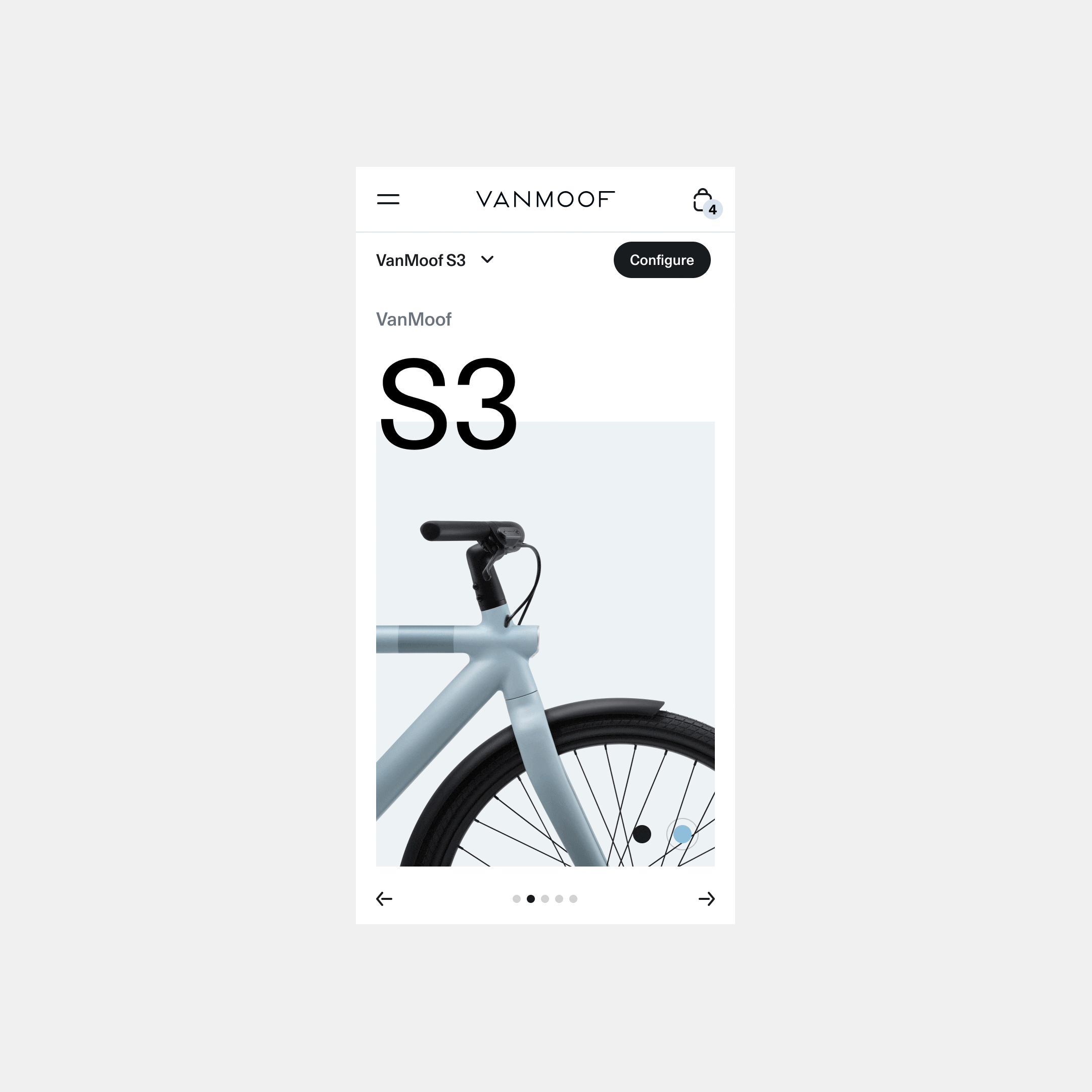
Product Detail
For the Product Detail I worked on several concepts of the current S3/X3 page, with the opportunity to test some of the quick wins and set a strong foundation for the next release of bikes with these learnings. I worked with the Experience Designer to propose a restructure of the current bike features and components, to highlight more the areas which are more valuable to the rider and making other areas more brief for less key specifics.
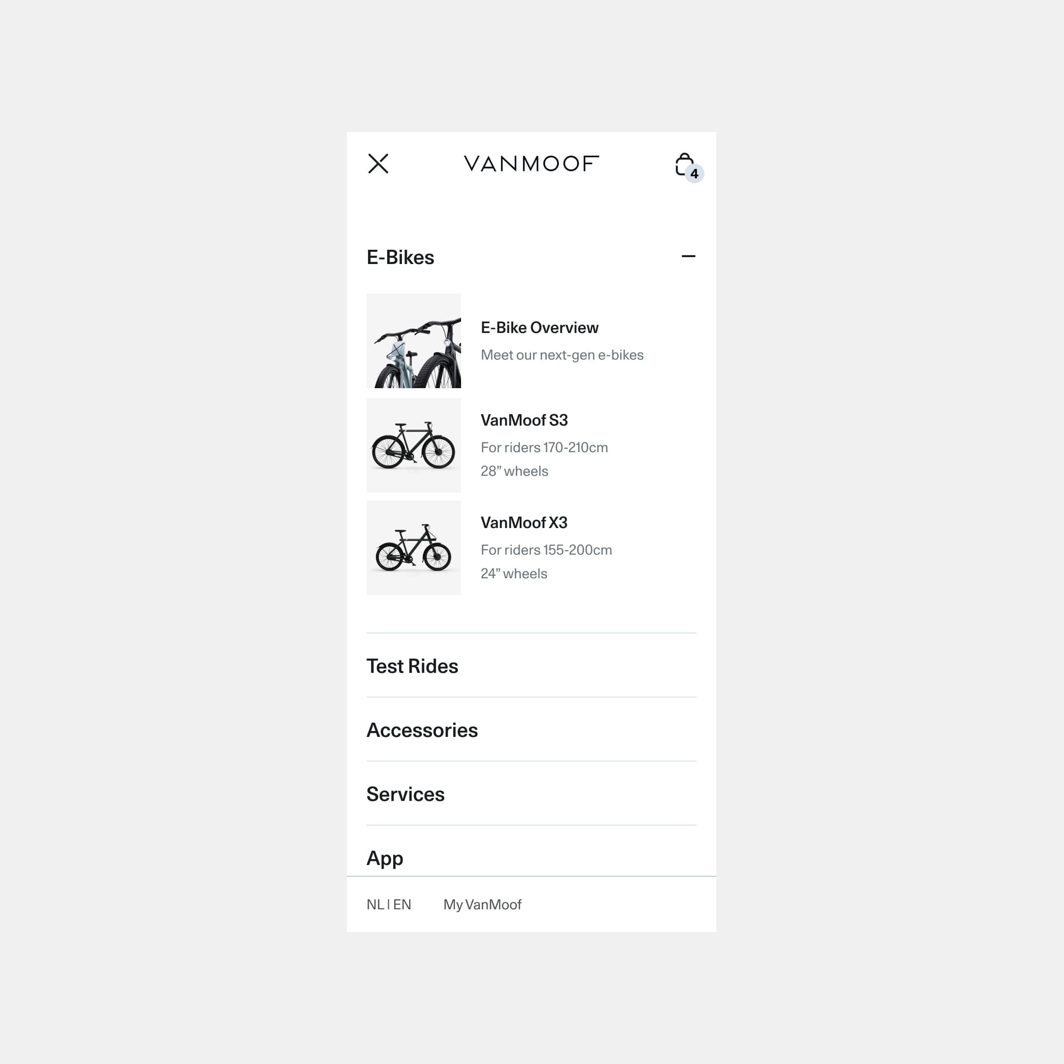
Navigation
The navigation was refreshed and restructured to allow much more flexibility with the number of links at the top level, and introduced a seconds level so VanMoof has a more scalable solution for the number of bikes they have available. I opted for a side panel on desktop so we could use a large amount of space to compare the two bikes visually.
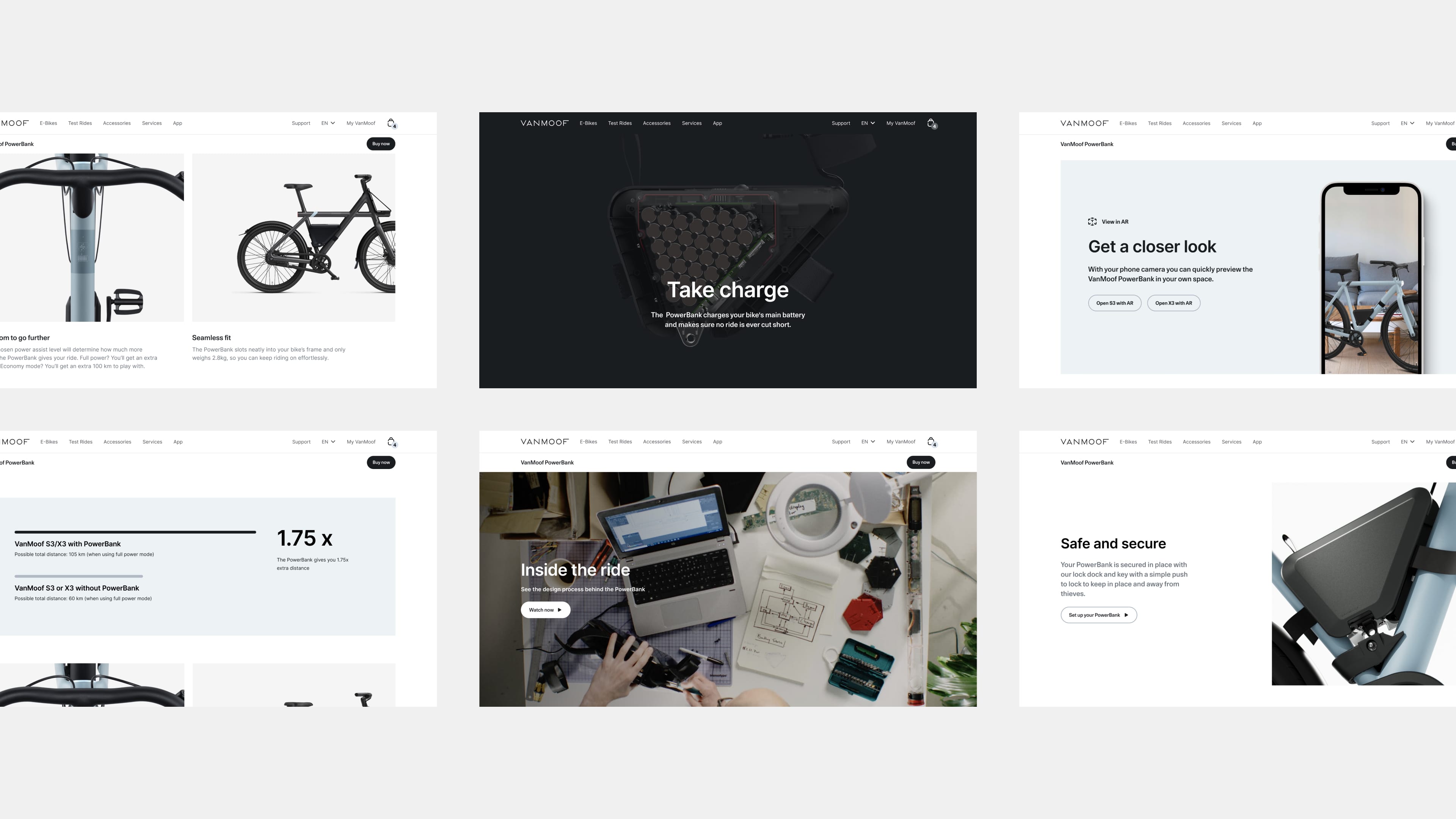
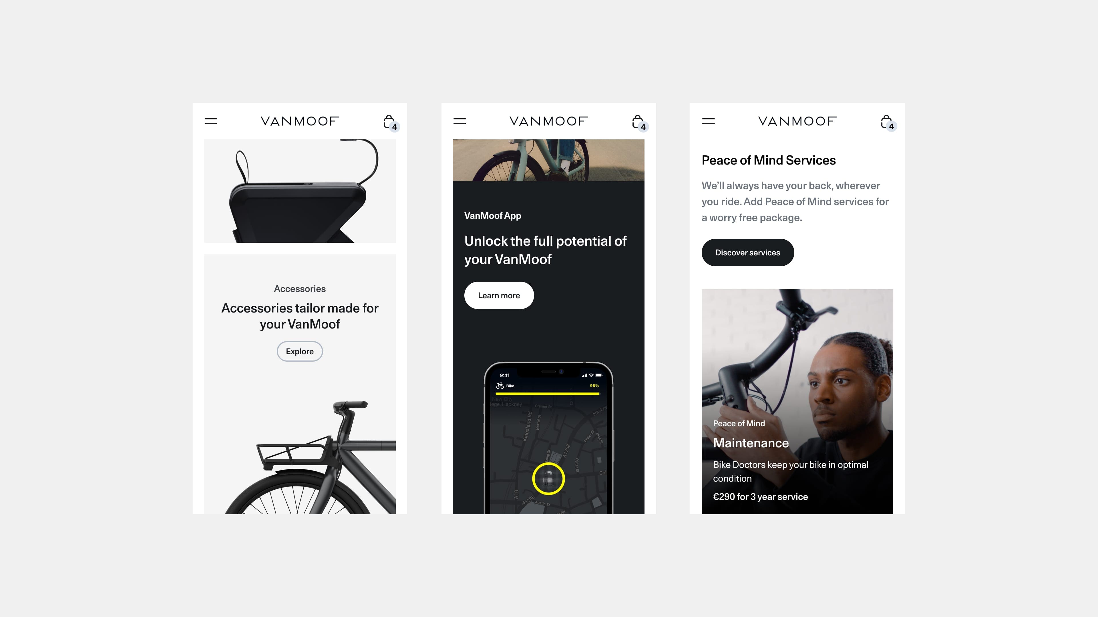
VanMoof PowerBank
The VanMoof PowerBank was a new accessory launched alongside the 2021 refresh of the S3/X3 bikes. We wanted to make a dedicated product detail page for this to highlight the features in a more impactful way than a simple accessory store page and show how the battery fits on both bikes, with photography and AR.
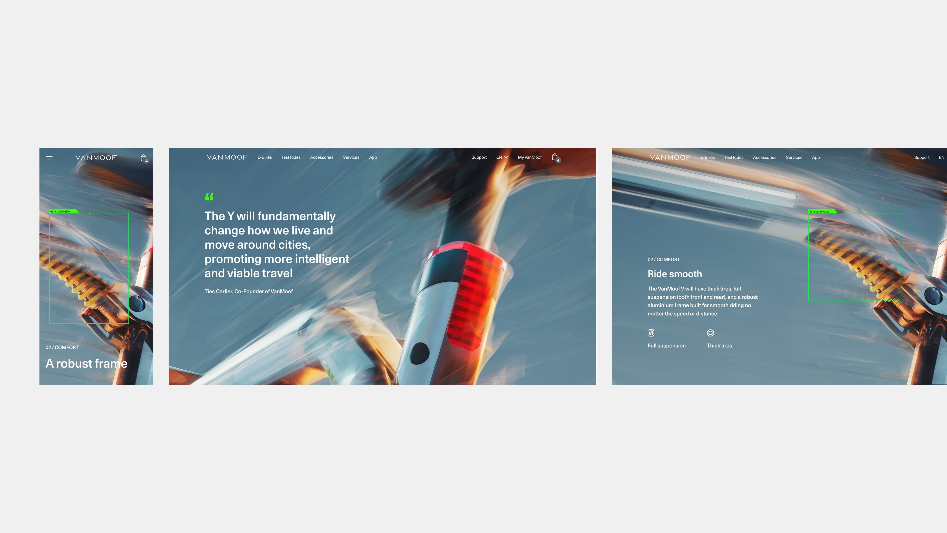
VanMoof V
We created a product detail page and reservation journey for the announcement of a new bike in the early stages of design. The campaign has a futuristic direction, with the green boxes and labels (reminiscent of representations AI). In the campaign these draw on roads, highlighting how the form factors of road vehicles are changing, and then later highlight the specific components of the bike, as seen on the product detail page.
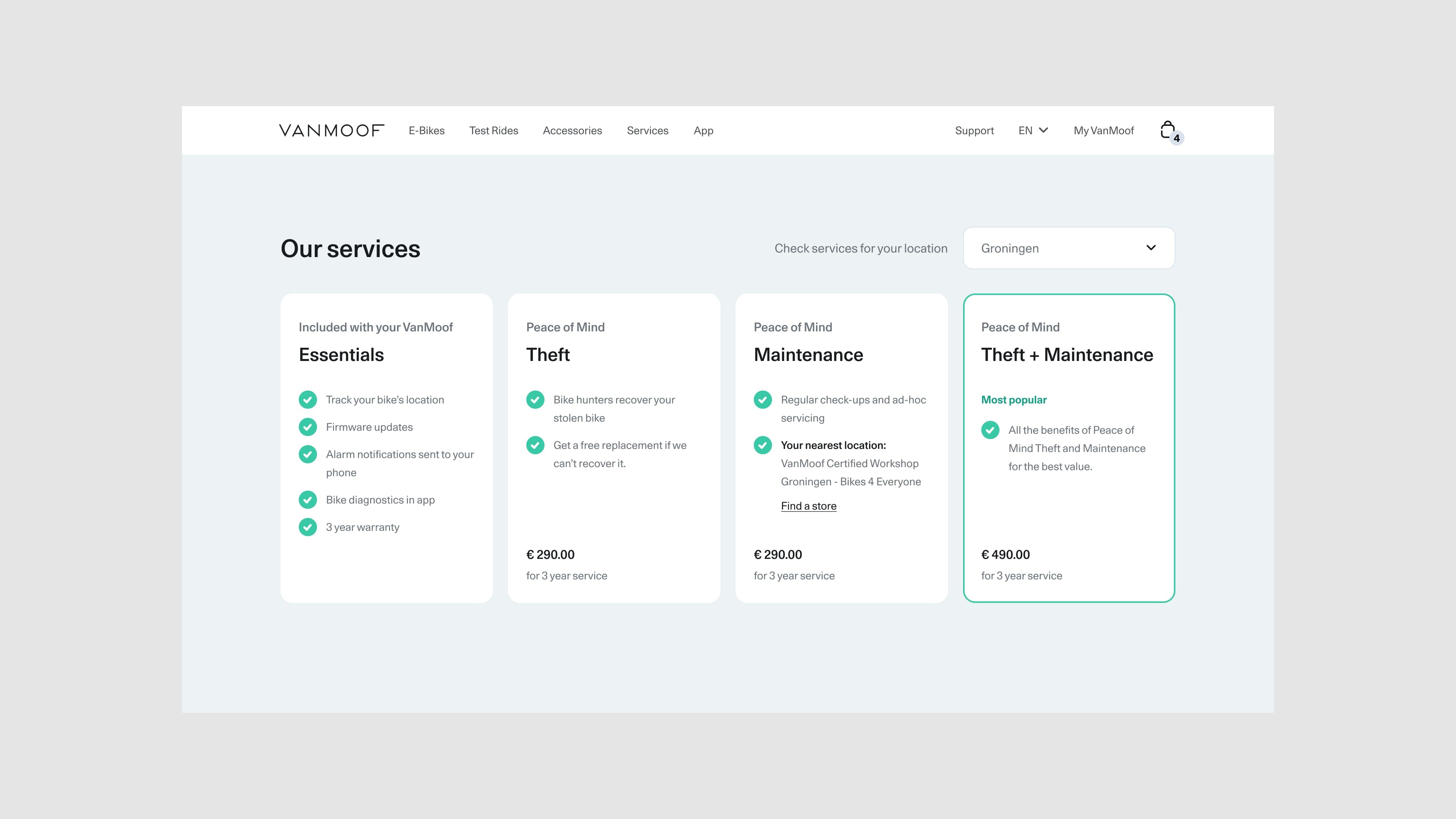
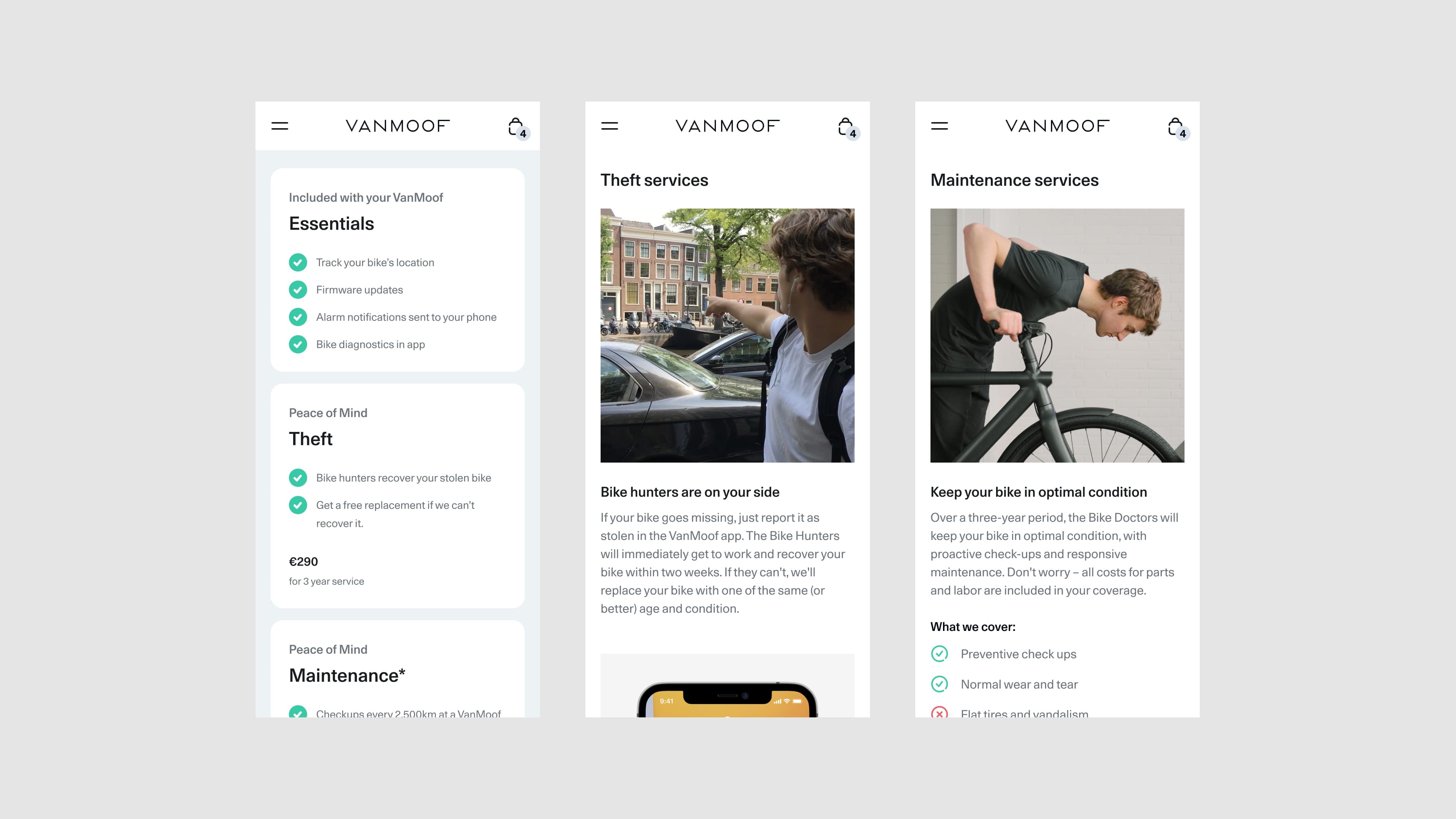
Services
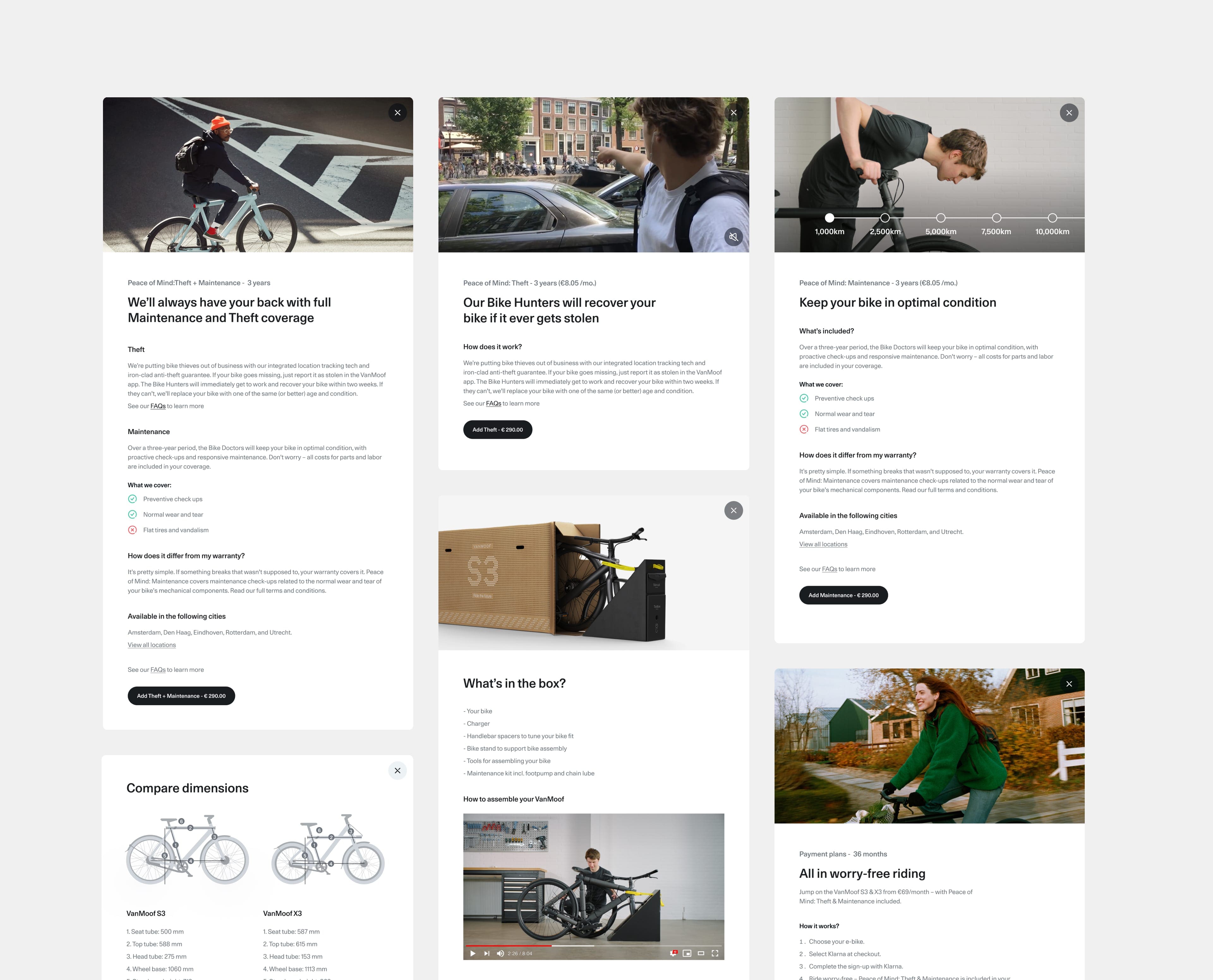
FFor VanMoof's insurances services (Peace of Mind), the content was refreshed and restructured show the services and process in a more contextual and clearer way. As the services are very dependant on your location, I used a set of dynamic cards to provide and overview of whats available and where your nearest store is.
App Overview
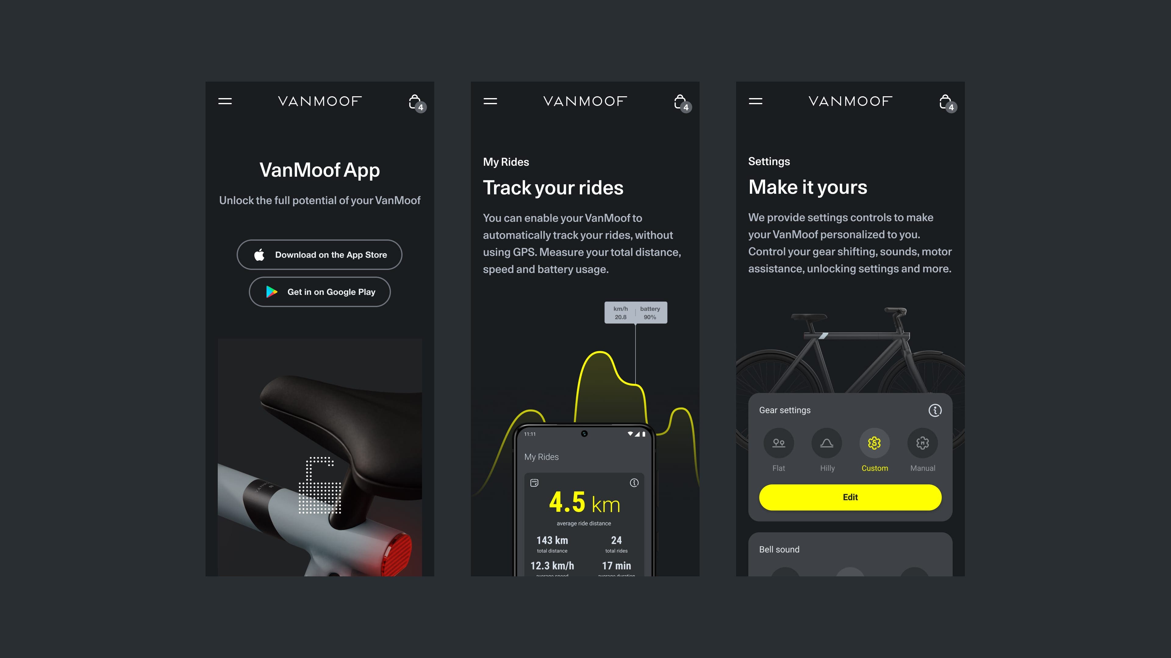
SA page dedicated to the app was added to highlight all the smart features of the bike, and show how customers can get more out of their bike and customise the experience. The page shows the core features of unlocking, tracking rides and managing settings. At the end a simple secondary format is added below to wrap up the secondary features which can be added easily.
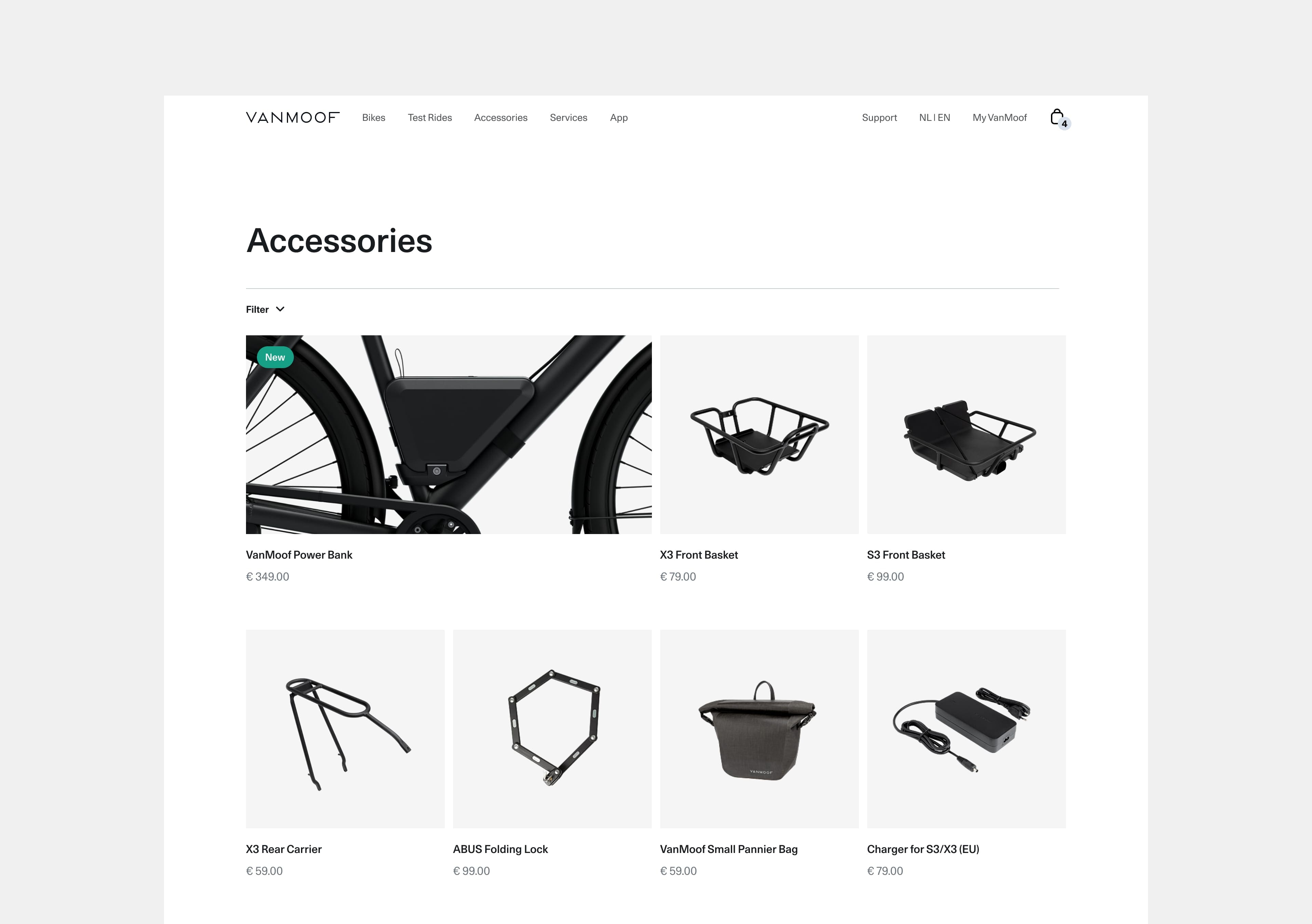
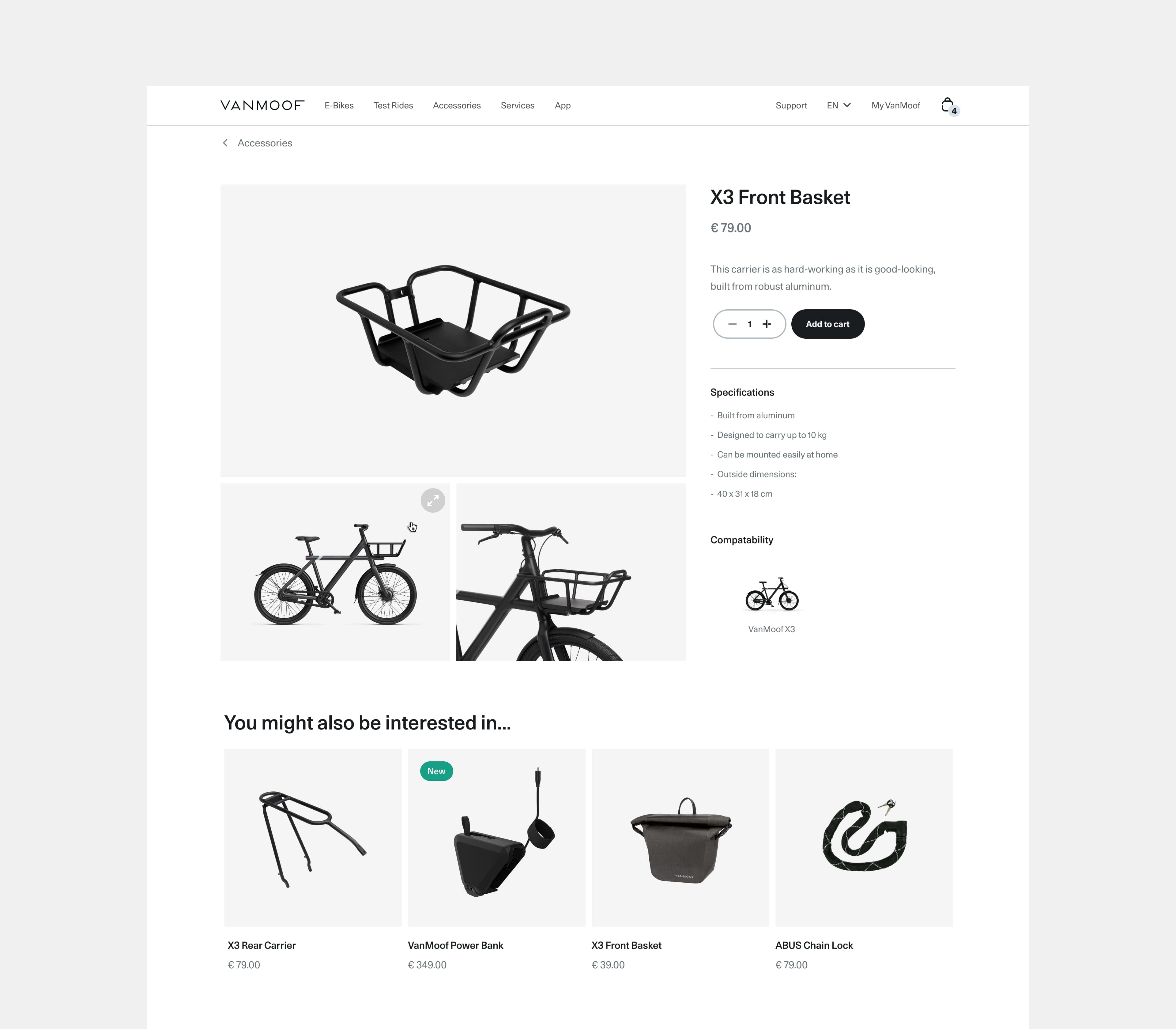
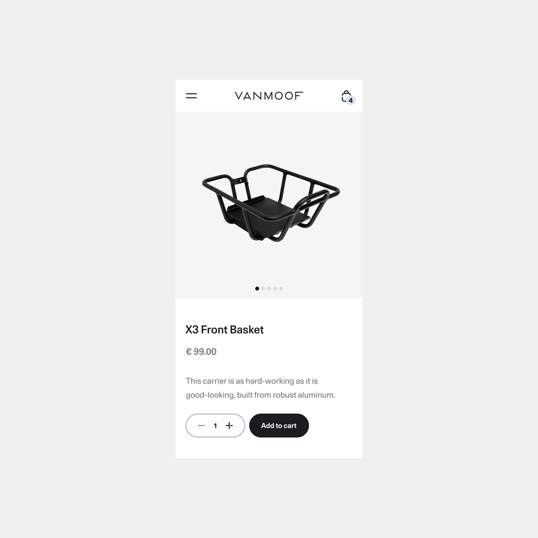
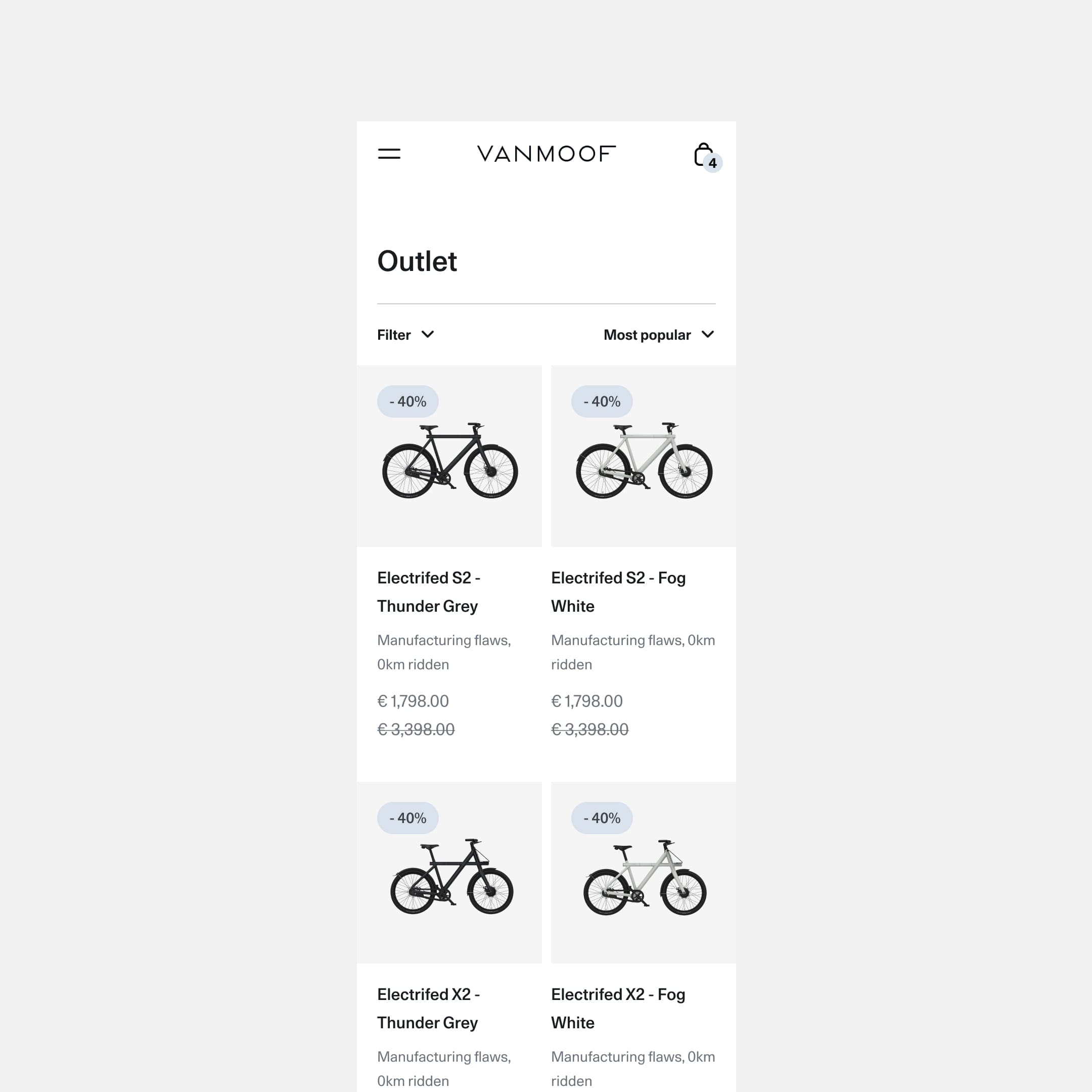
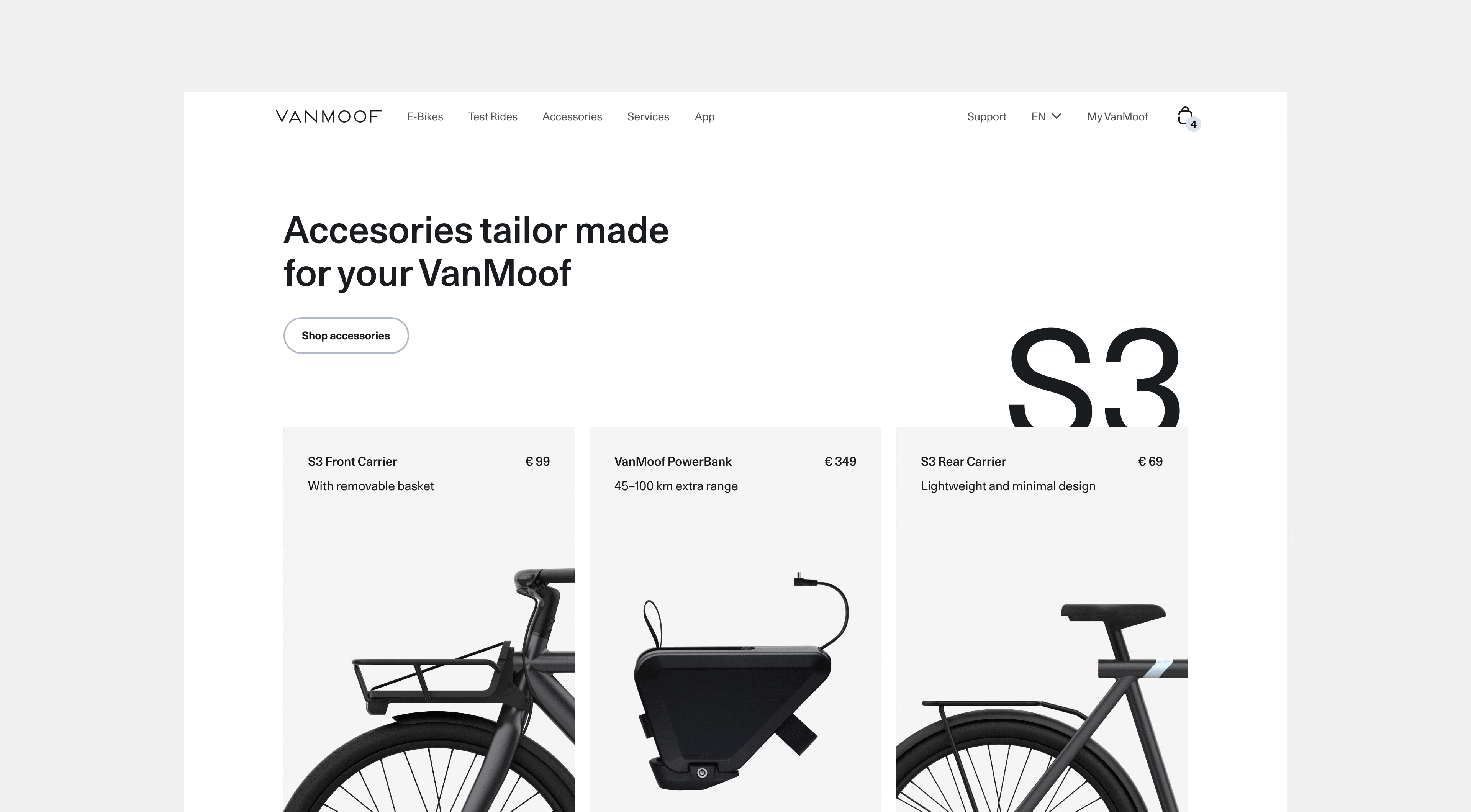
Store
The store experience has a visual overhaul and clean up the layout and to showcase all the accessories in a minimal layout. On the overview a product can be promoted with tags and a larger space for featured releases. On the detail page the gallery structure was adjusted to encourage users to see all views of a product. This store was designed so we could use the same template for both the accessory and outlet store.
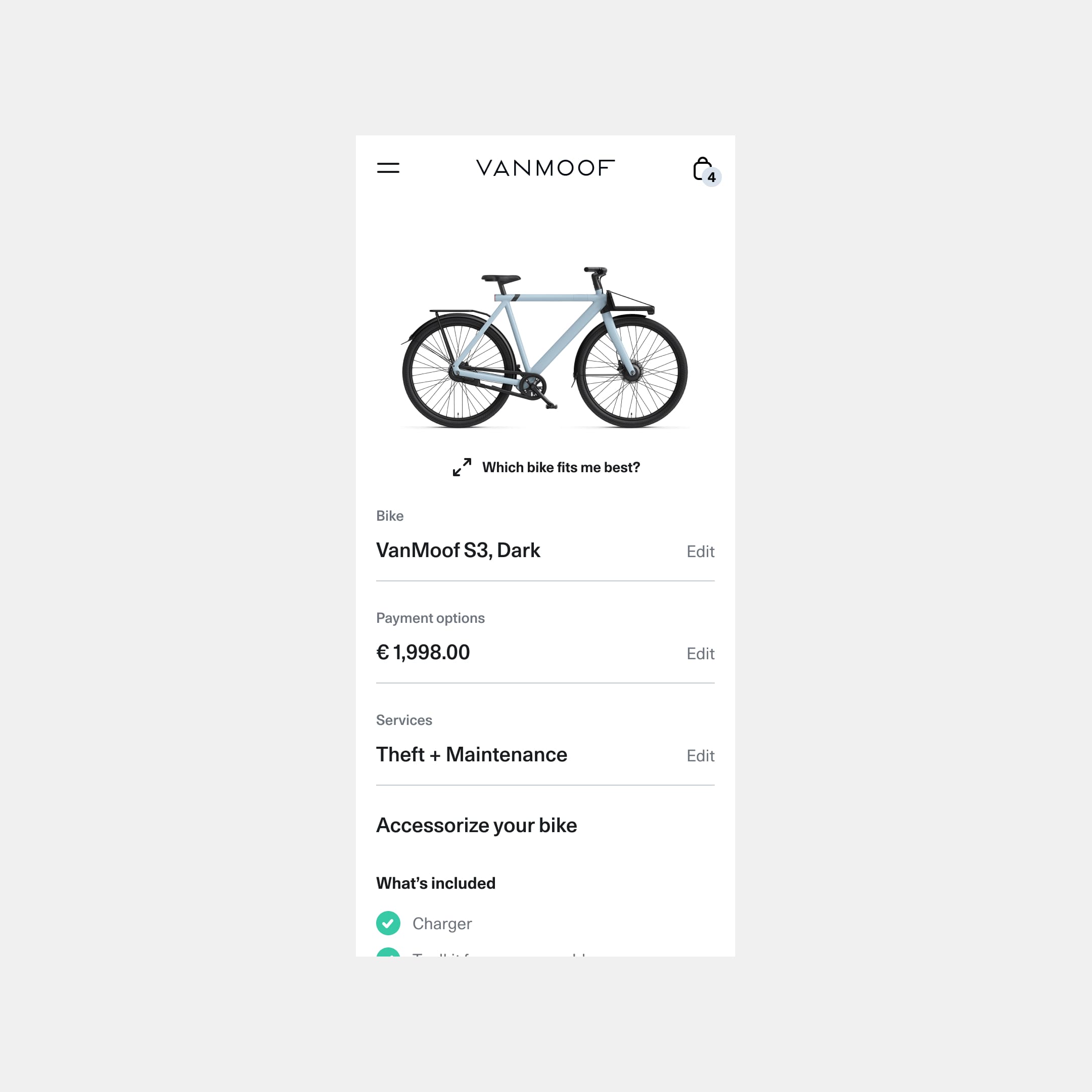
Configurator
The configurator is the step where you how you want your bike to be set up. I worked on a concept where the navigation through the steps is on the right, and provides a summary of all the previous choices you made, while making it easier to step back. The fit finder tool is added in various points of the journey, but is key in the configurator. The tool is useful to recommend which bike fits best depending on your measurements, especially helpful for customers who live too far away to take a test ride.
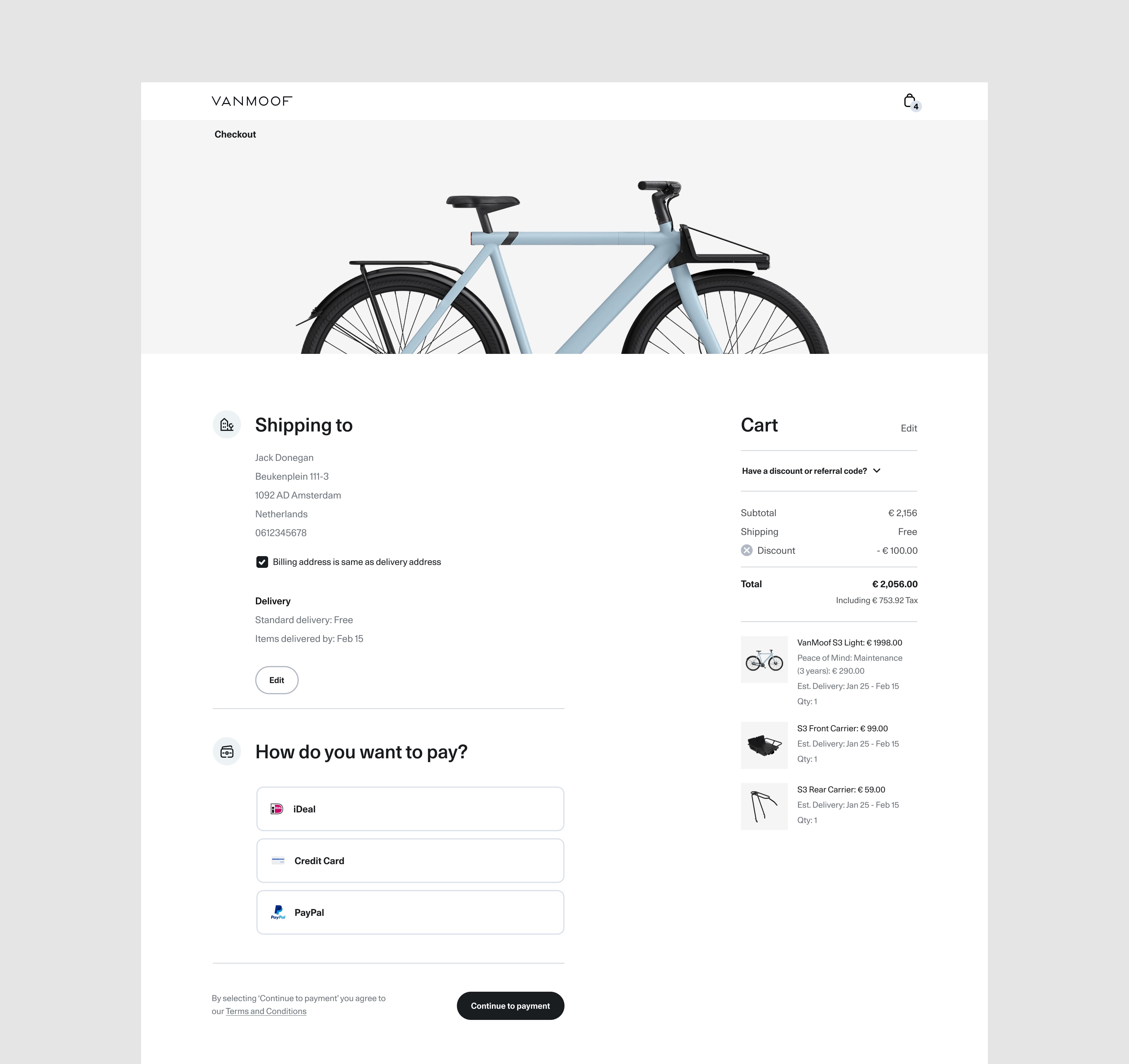
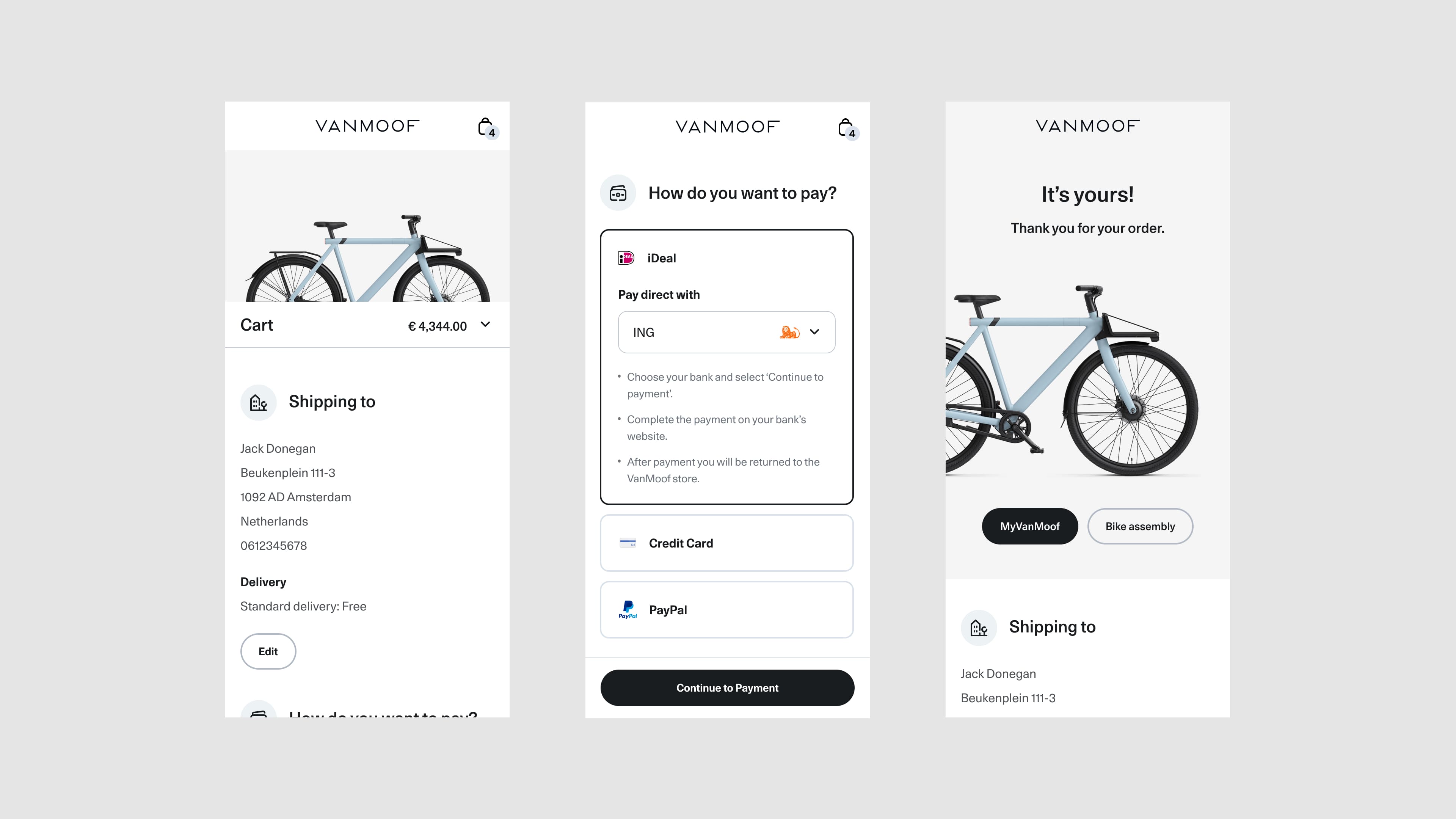
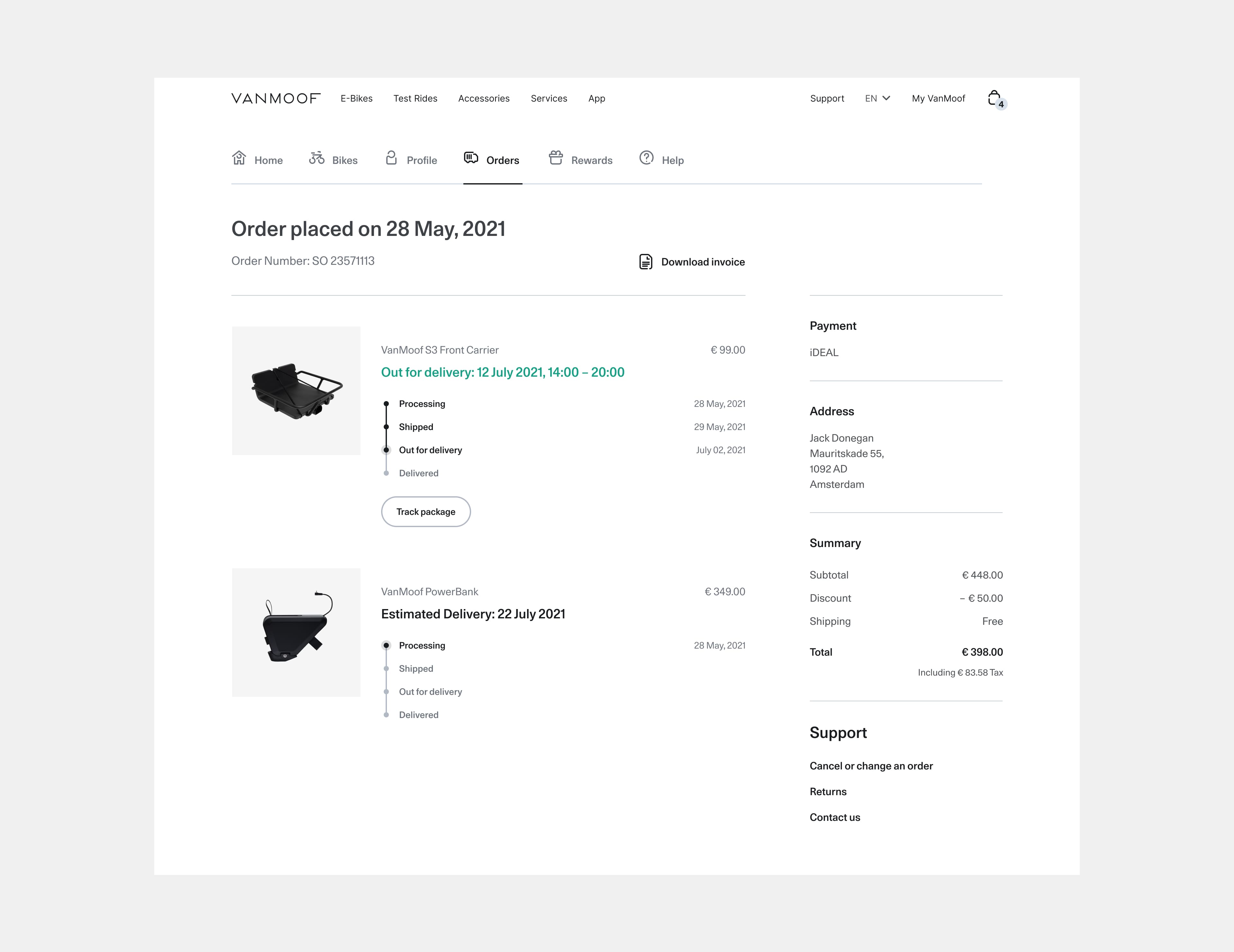
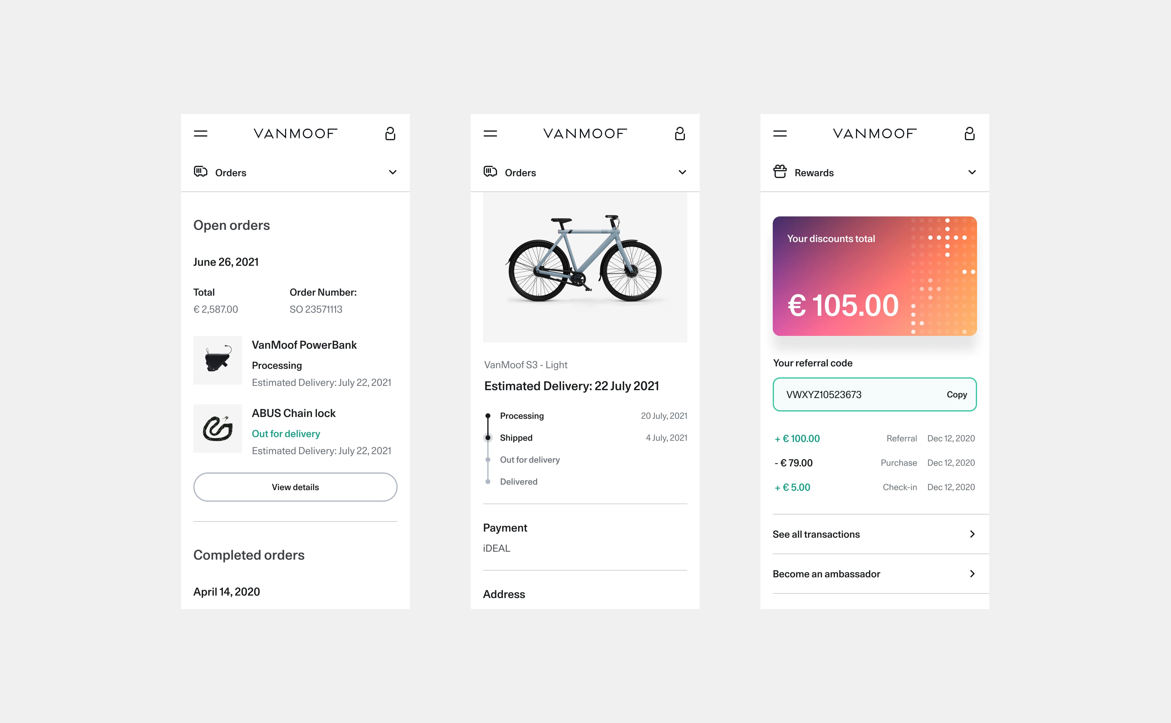
Checkout
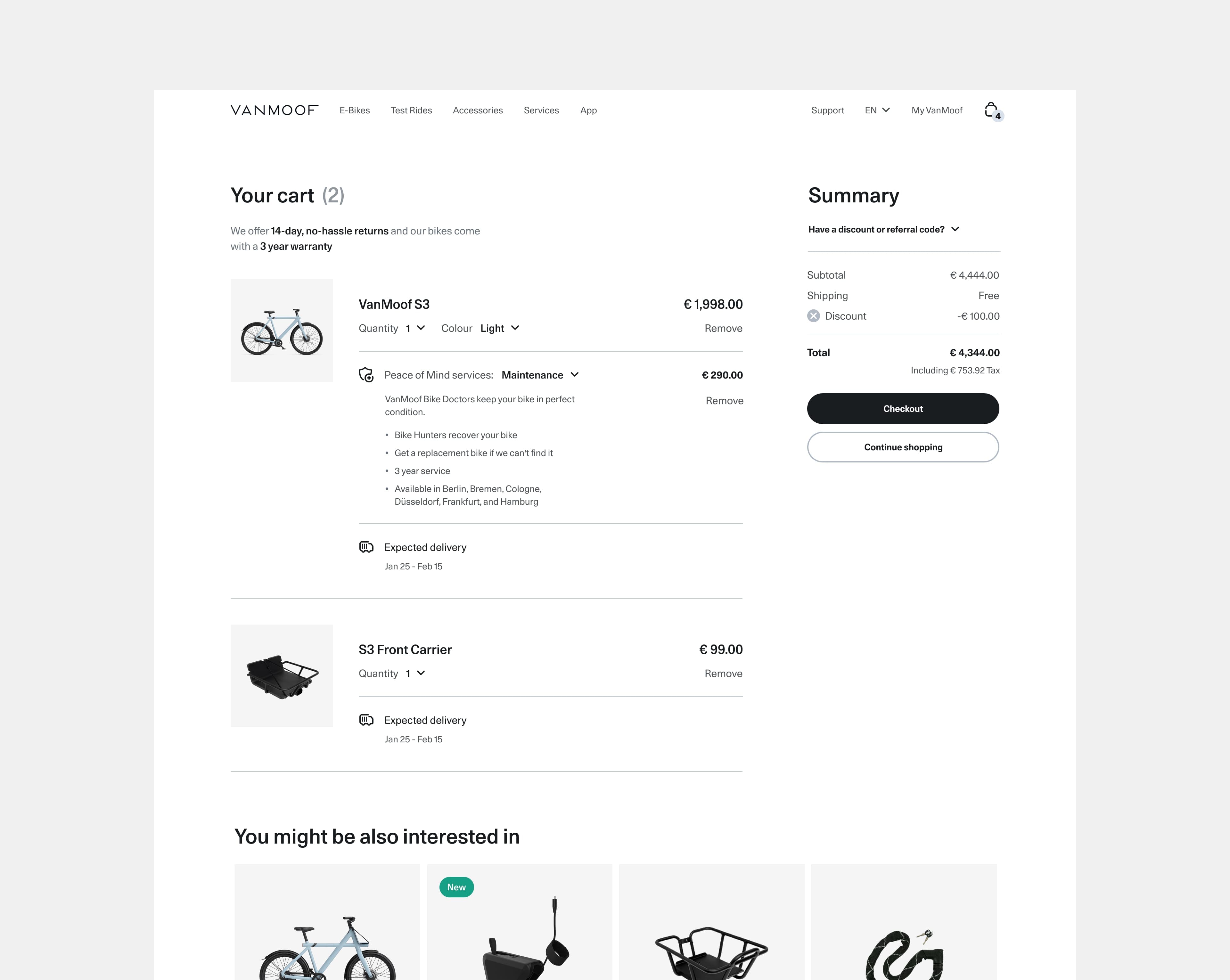
The cart was revamped with a full screen layout rather than a mini-cart. Allowing us to add much more to make larger orders much easier to review and manage. Adding product thumbnails, controlling styling and insurance options, discount codes and estimated delivery windows per item. The checkout flow was streamlined for returning customers and the ui was refreshed to be aligned with the same selection controls used elsewhere.
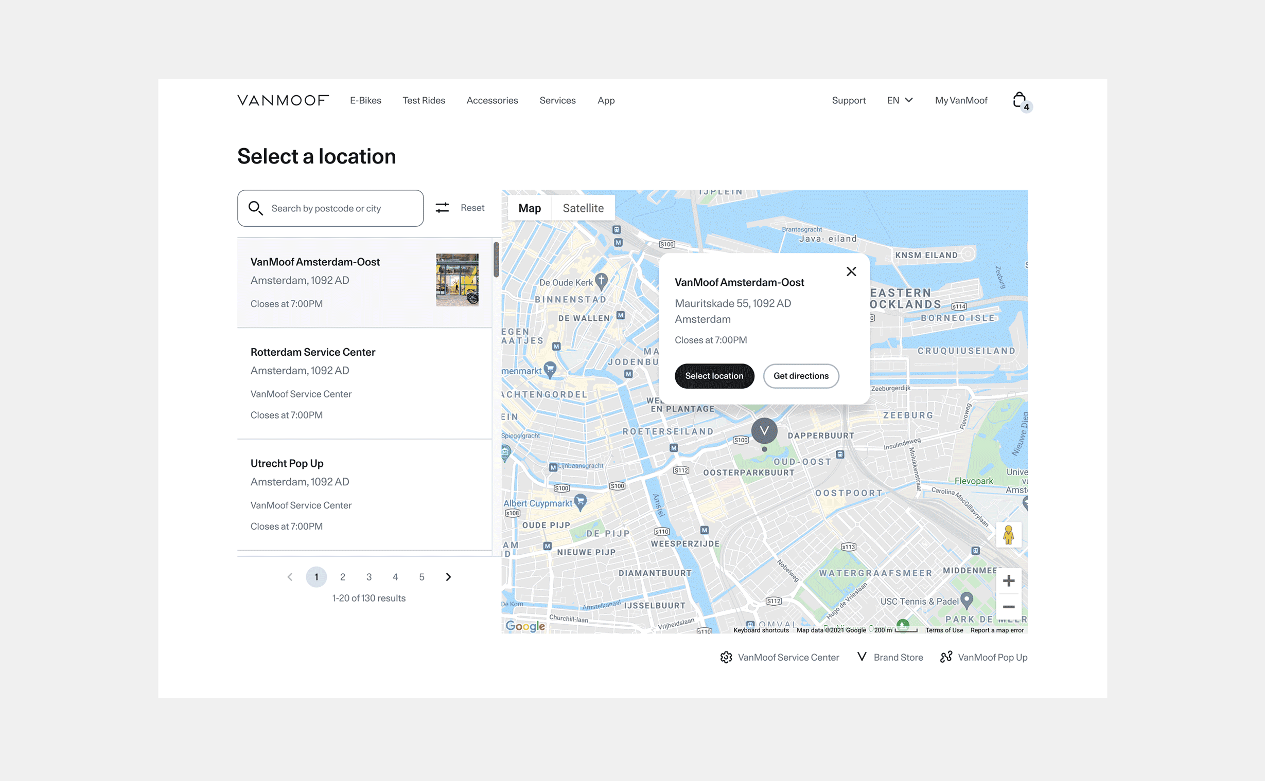
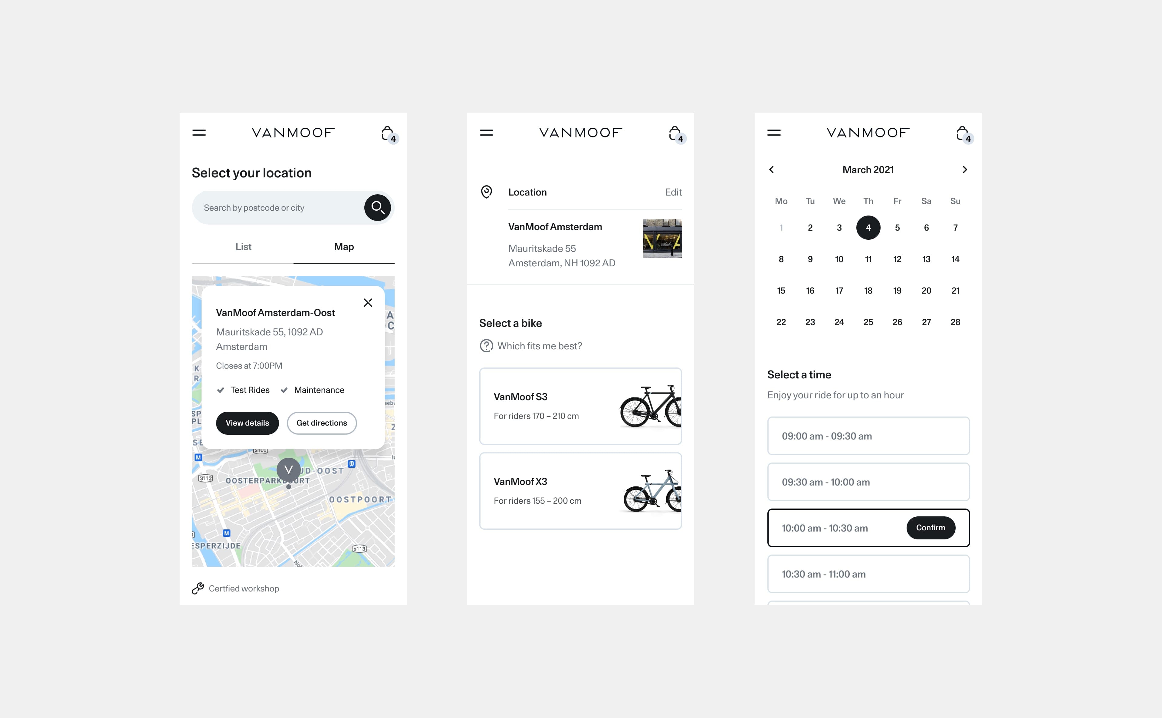
Test Rides
New video content was used here to make the experience in an exciting way, following the riders at speed. For the booking journey the store finder map was improved for a more scalable solution which also worked best on mobile, while the rest of the selection ui was refreshed and aligned with the design system.
Emails
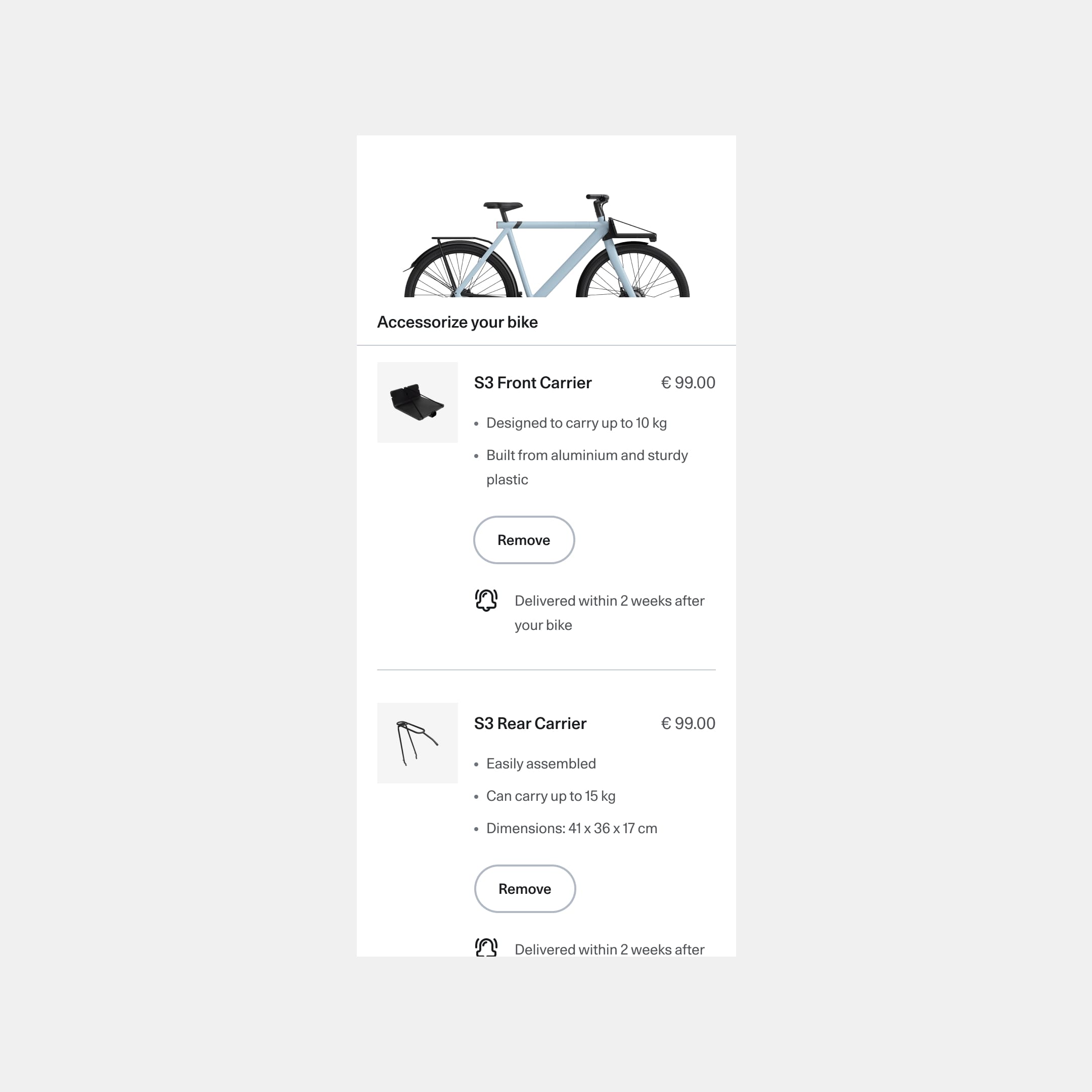
I worked on a various emails designs and established a design system to help create and develop new email templates. Previous emails were very text heavy, so the main focus here was to make the content as visual as possible with icons, illustrations and photography. Information was trimmed back where possible and sections where broken up to make the emails more digestible and easy to scan.
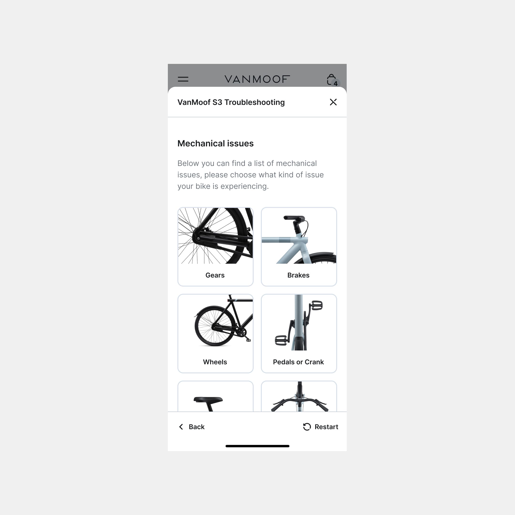
Support
Concept designs for a restructure and redesign of the support site. Making it easier to find relevant articles by providing a new navigation for all categories, on each level of the journey, while making clearer entry points into a troubleshooting tool to determine the issue. For many of the how-to articles there is guided video tutorials. The articles can also allow riders to see the tools and replacement parts required, and give them an option to either bring the bike in a for a repair under warranty or repair themselves at home for simpler fixes.
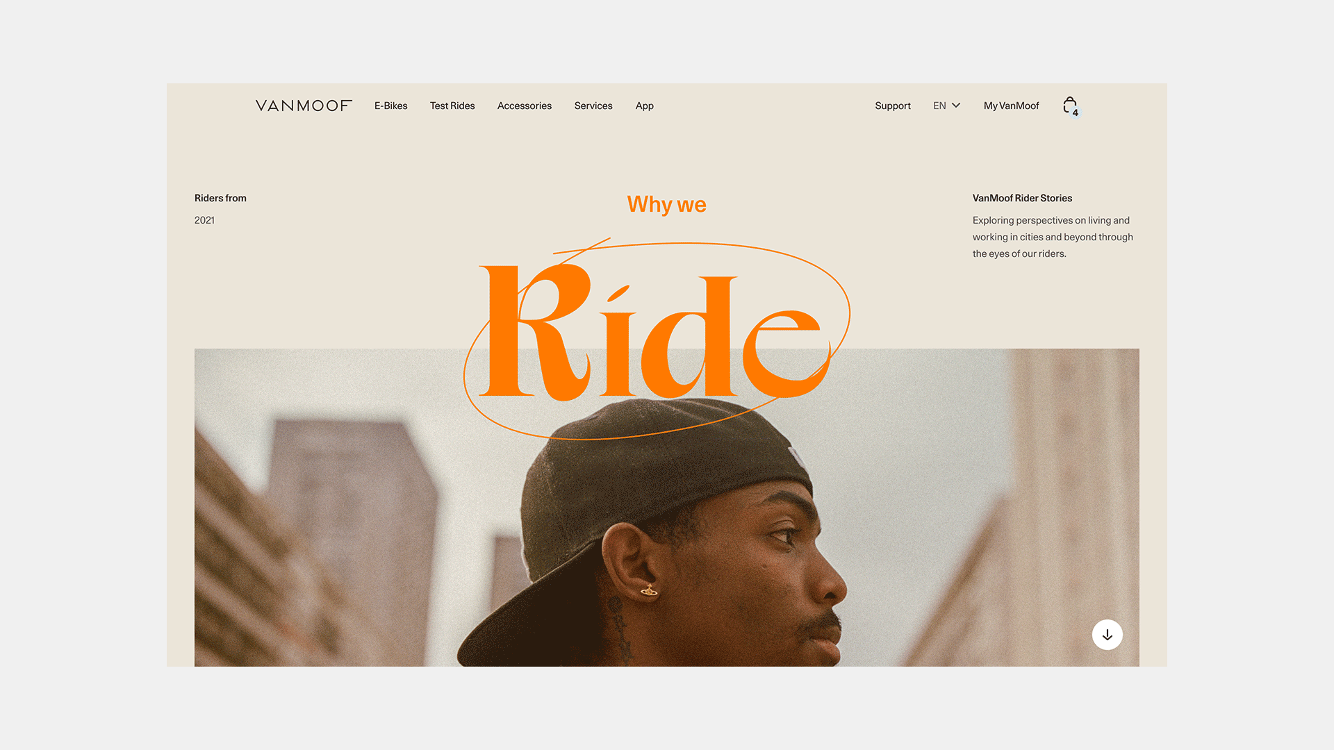
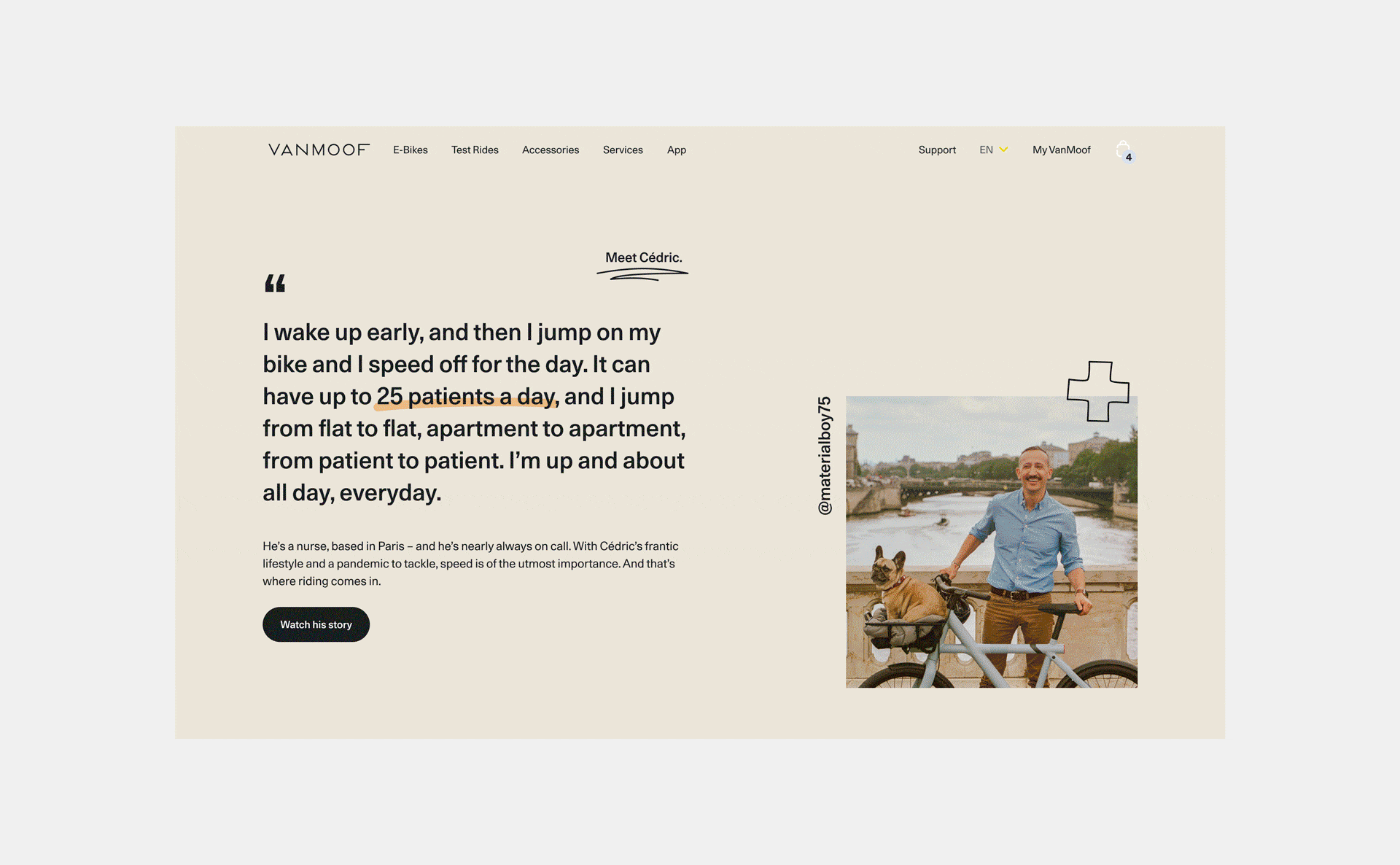
Rider Stories
This page was to tie in with a regular social campaign. Exploring the perspectives of VanMoof riders from all kinds of backgrounds. The layout feels more editorial, almost like a magazine unlike the rest of the functional e-commerce side. The layouts are more playful and personal, with portraits and drawings to connect with the pull-quotes.