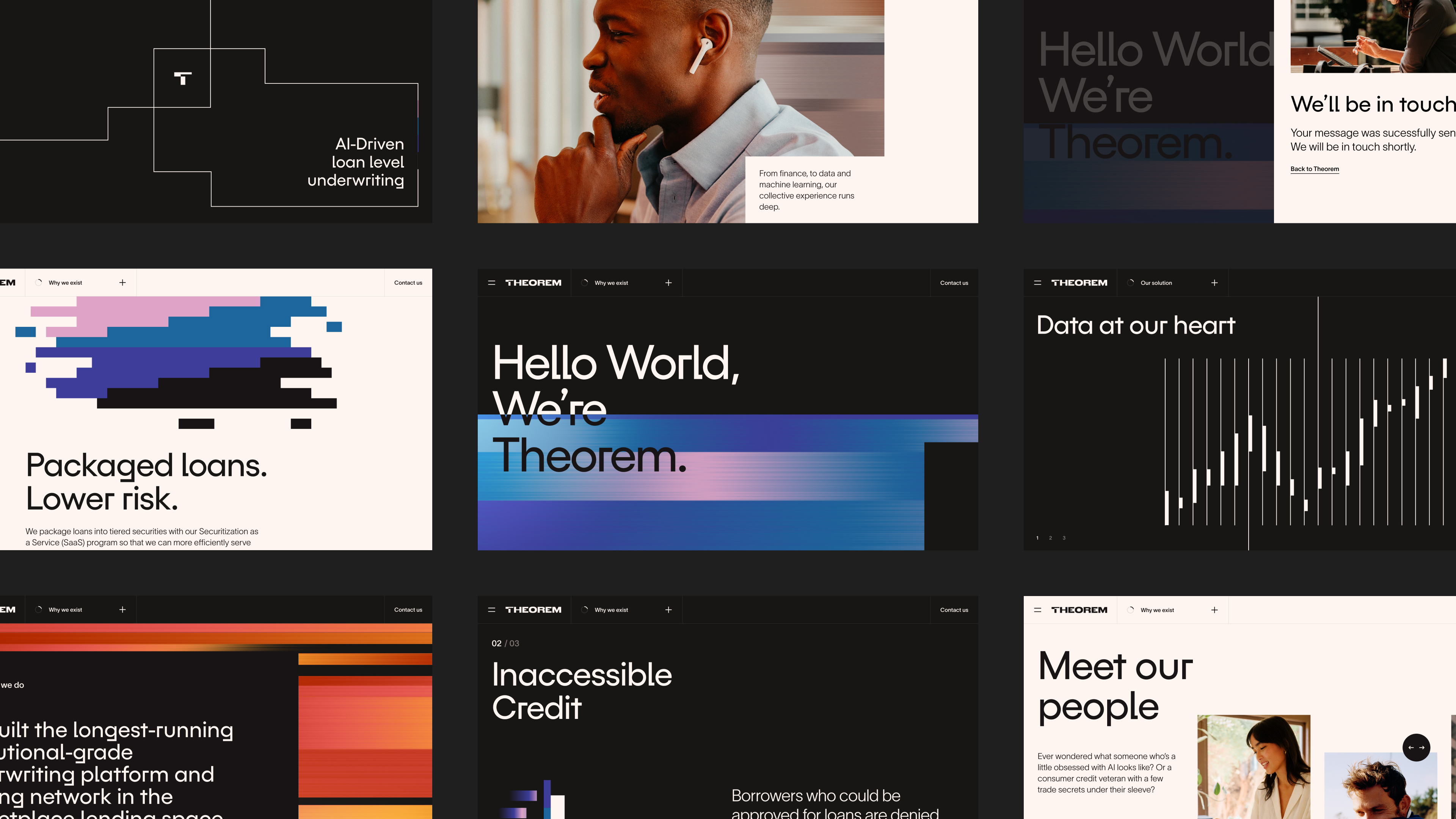
Theorem’s role in financial services is introduced by highlighting the current issues with underwriting.
Insights into how the technology works are brought to life with animated illustrations.
Abstract textures are used to provide a sense of movement. As the brand concept revolves around Theorem working as a conduit a channel of information between lenders, originating partners and borrowers. So the animated elements are visualisations of the conduit.
Initial explorations of the navigation. We opted for the second approach as it felt more on-brand and is more flexible.

Theorems services on offer were also visualised through animated illustrations to work as a visual metaphor.
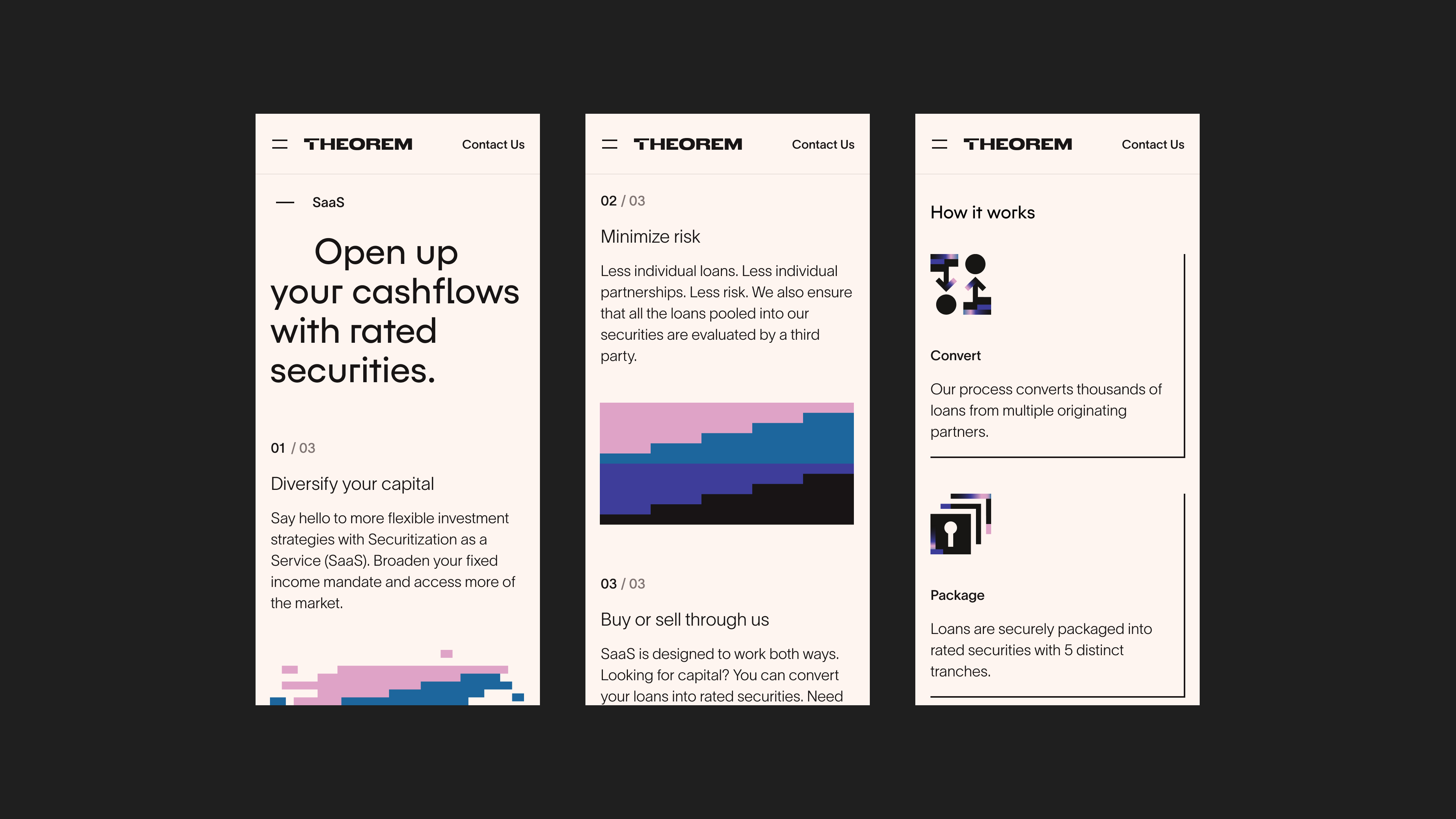
We decided to condense the layout of this area to explain the services more efficiently.
We decided to condense the layout of this area to explain the services more efficiently.
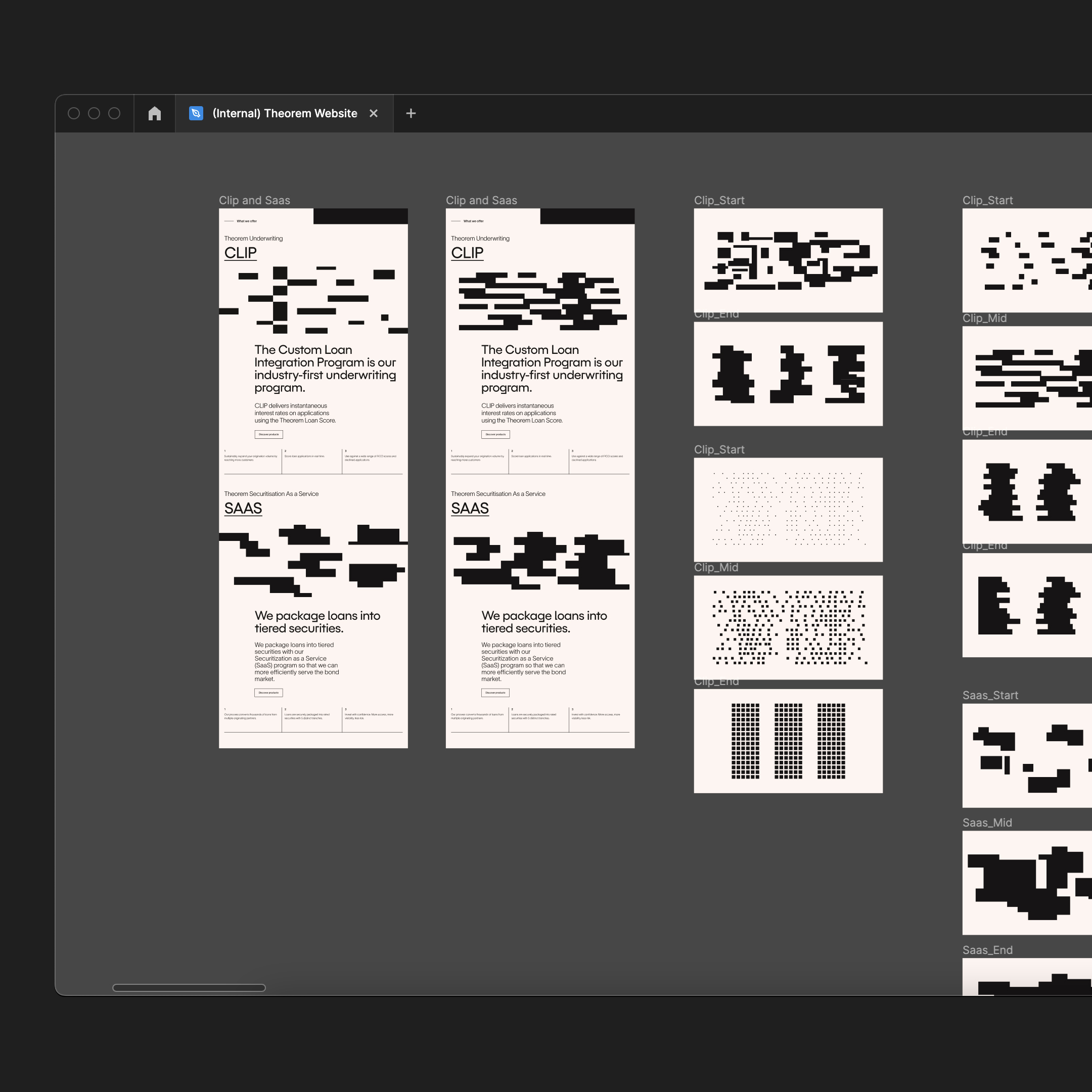
Early concepts for the illustrations of Theorem’s products (CLIP and SAAS). Sticking to the monochromatic colour schemes was fairly restricting and made it hard to visualise different groups and areas.

Examples of animations around the brand concept of Theorem working as a conduit.
Icons used Theorem’s gradient palette and were adjusted for dark and light colour schemes.
The textures used were produced via a web-based generator tool. Providing a lot of flexibility and precise control.

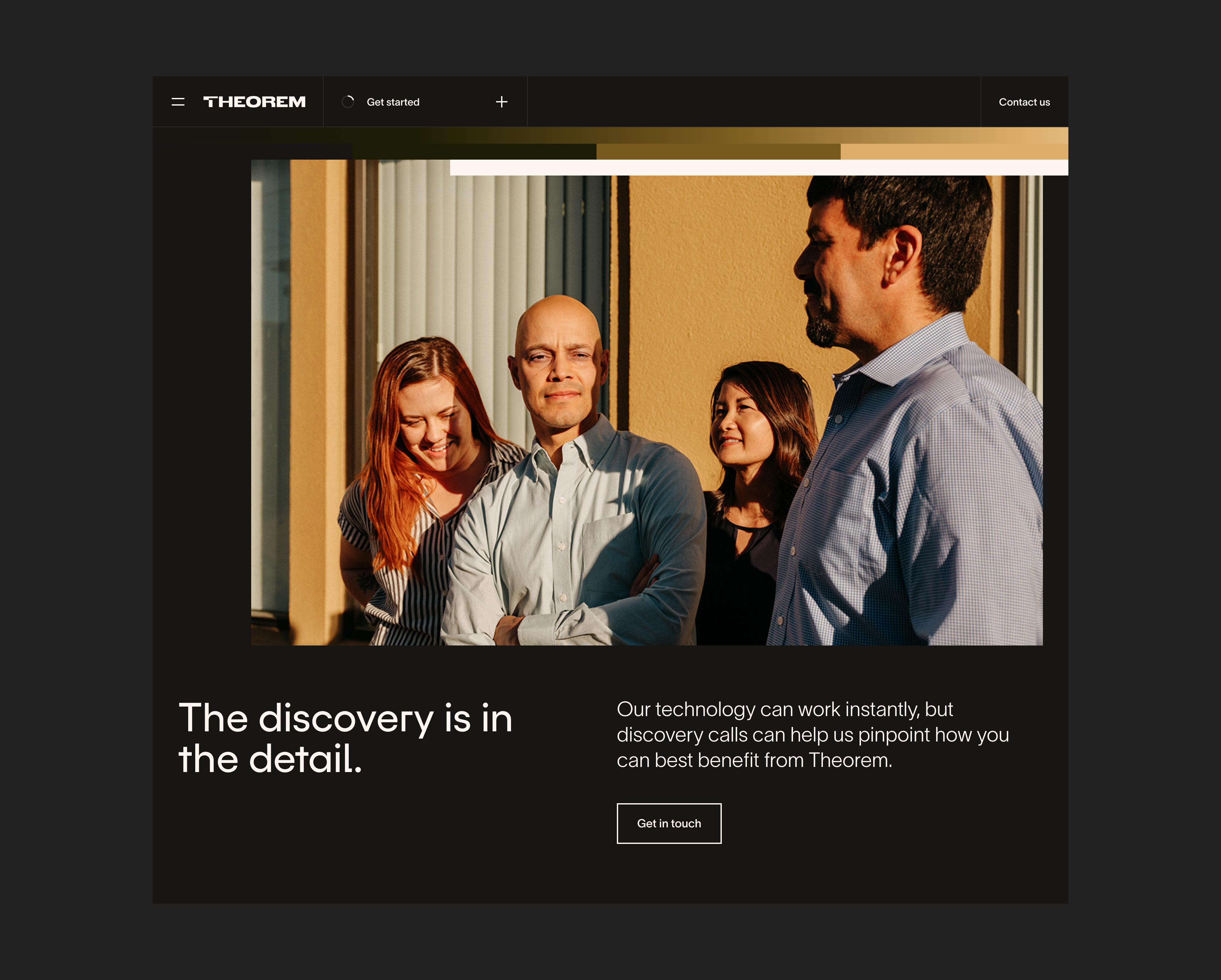
These textures were also blended in with photos to make them feel branded.

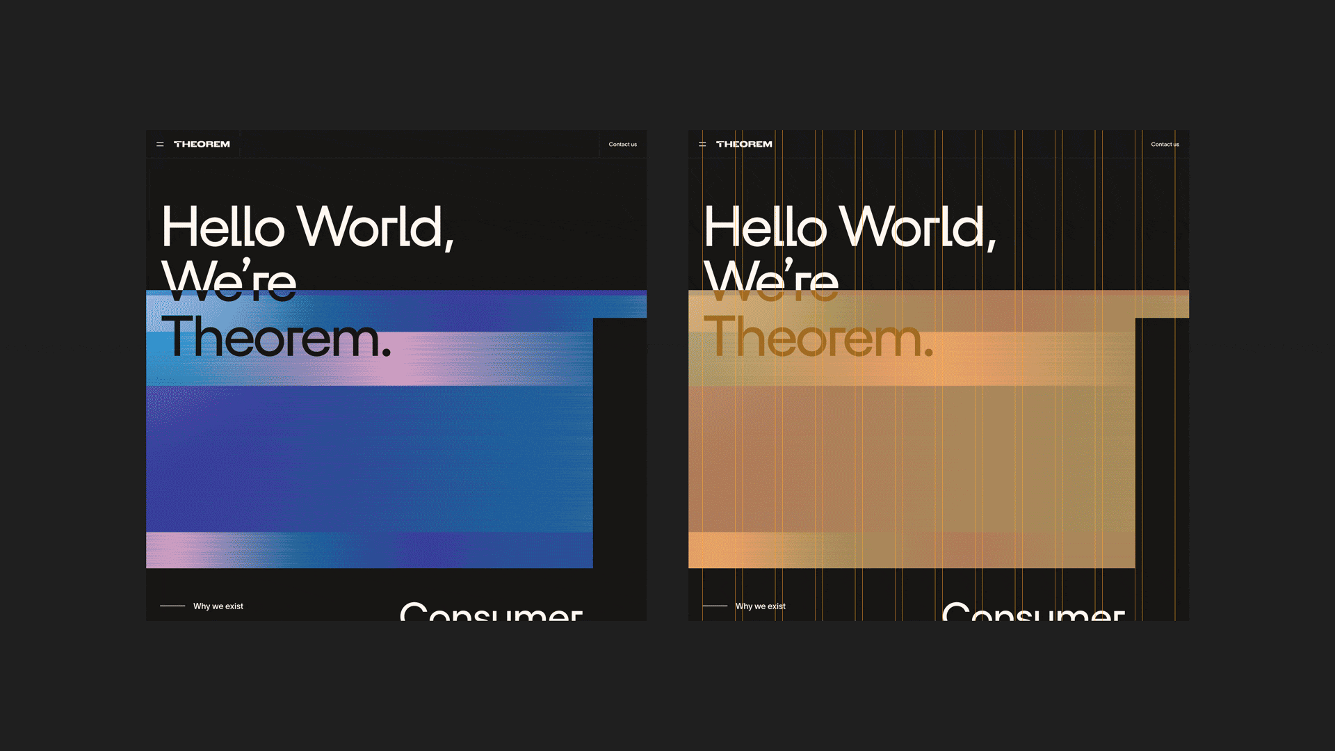
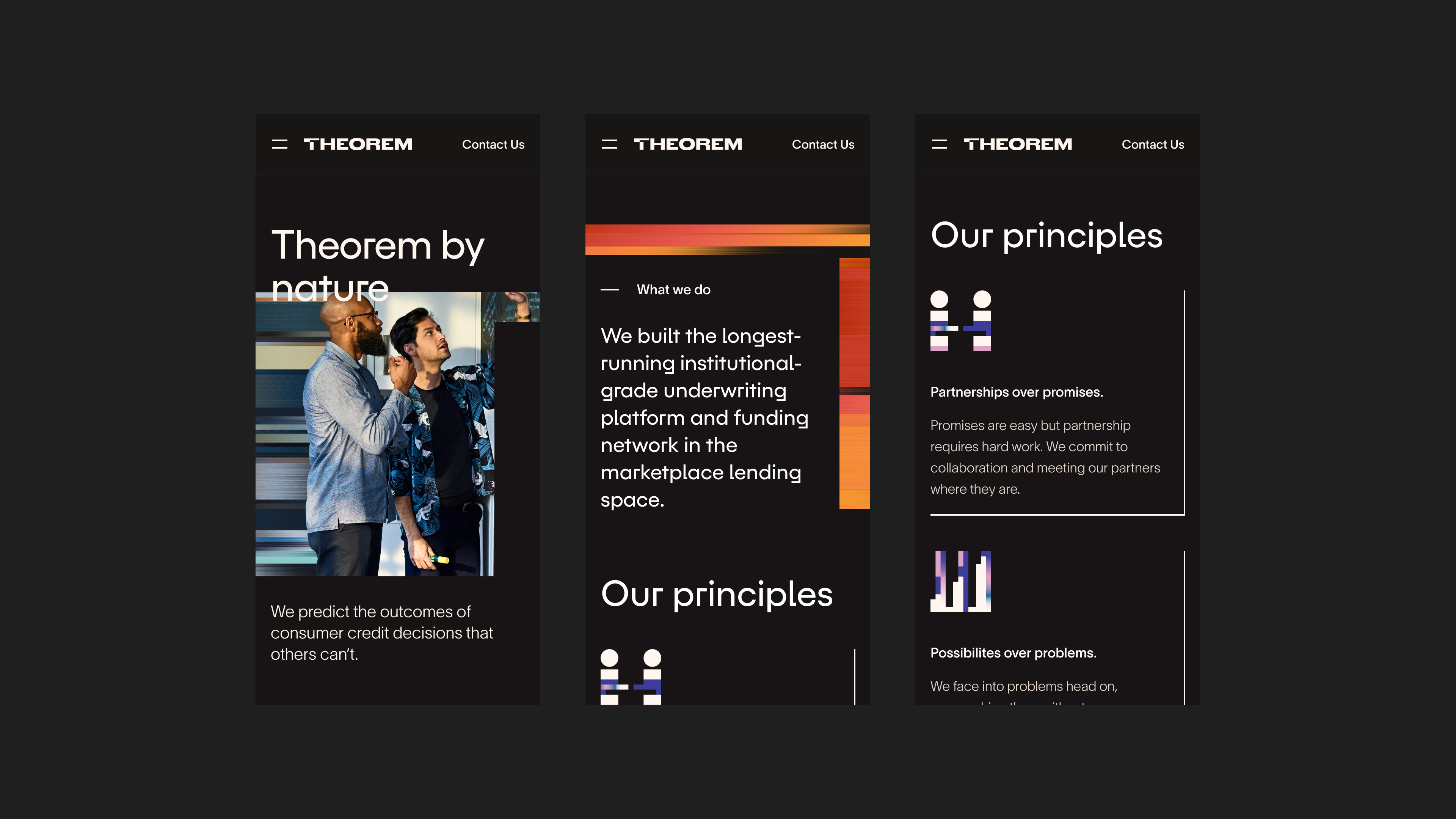
The T shape was also another part of how the layout was shaped. Several components were based upon a t mask shape to help for a distinct and cohesive direction.